About
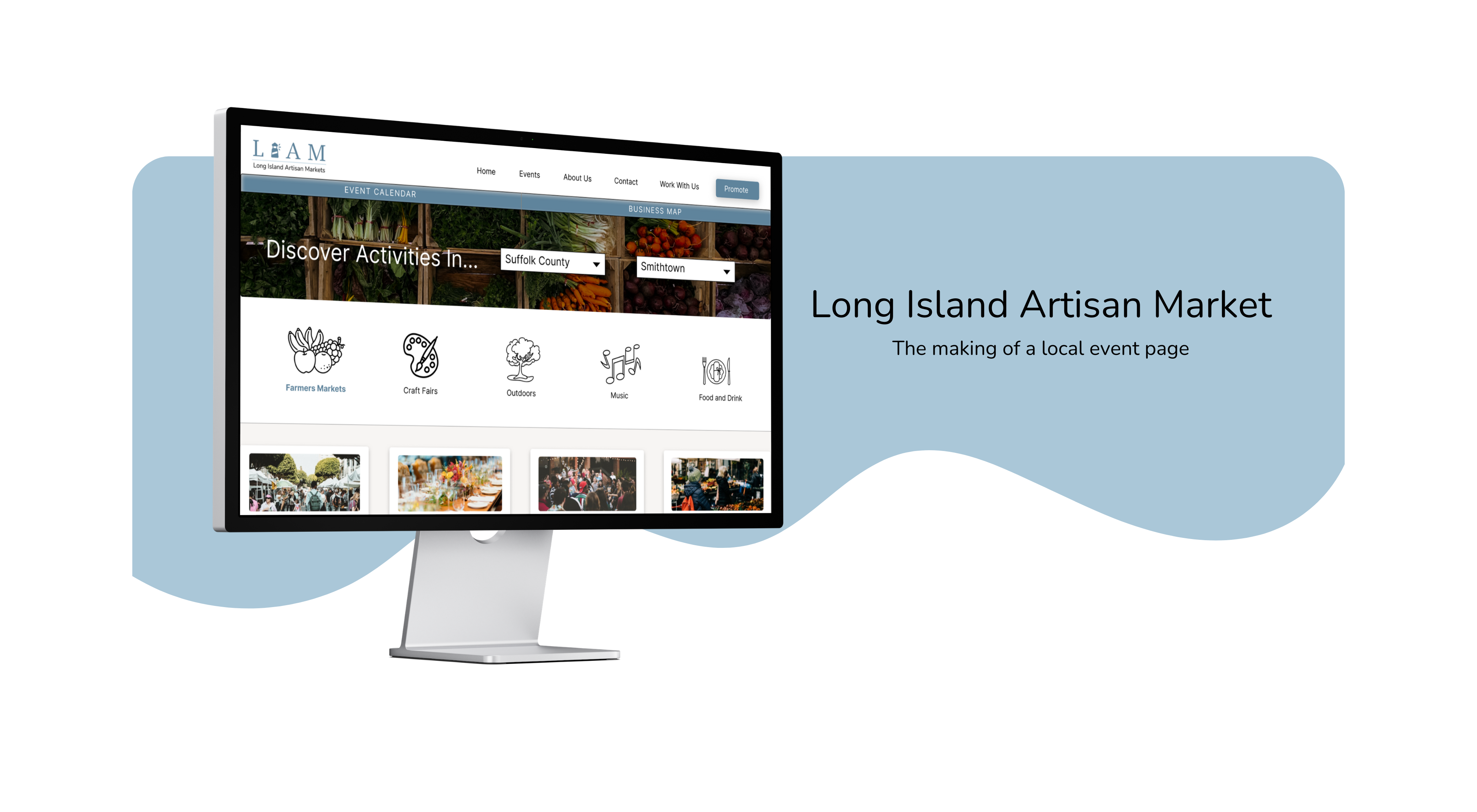
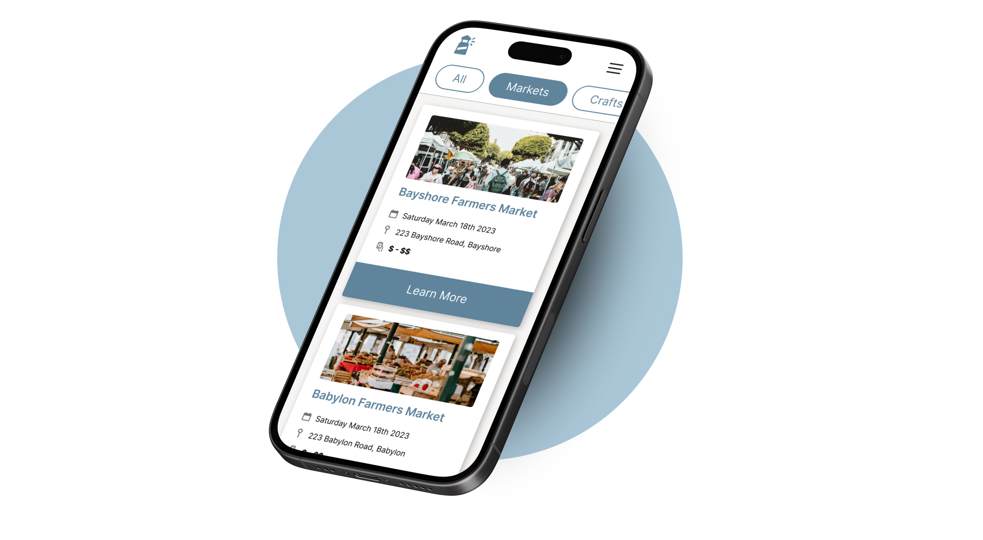
I teamed up with a local event influencer, to revamp their online presence by creating an appealing and user-friendly event page. The result? A sleek platform that excels in accessibility and smooth navigation, making it a go-to spot for users to explore and stay updated on local happenings effortlessly.
Role
Solo UX designer and developer
Duration
6 weeks for research and design
1 month for development
Client Goals
- I need a website that organizes local events, making it easier for users to find and engage with the activities that interest them.
- I want a designated space for small businesses to advertise, helping them connect with their target audience and promoting community growth.
My Goals
- Implement a user-friendly system for organizing events into categories, enabling users to efficiently plan and participate in activities they are interested in, on the days they are free.
- Create a designated and visually pleasing space for small businesses and events to advertise, focusing on seamless integration that benefits both advertisers and users.

Empathize
- Competetive Analysis
- User Surveys

Define
- User Personas
- User Flows

Ideate
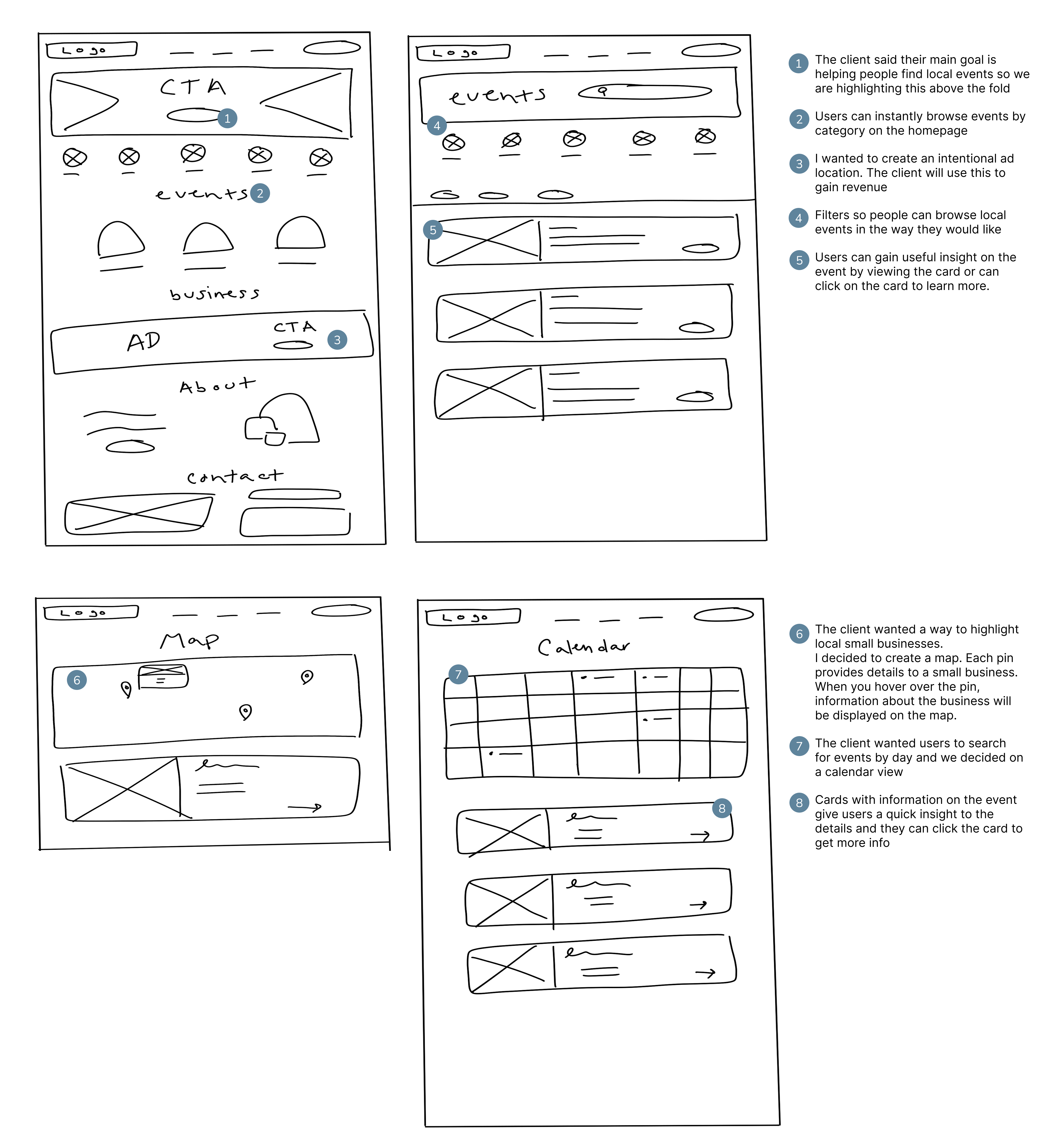
- Idea Sketches
- Wireframes

Prototype
- High Fidelity Wireframe

Test/Revise
- Usability Test
- Preference Test
- A/B Test
- Iterations
Empathize
Competitive Analysis
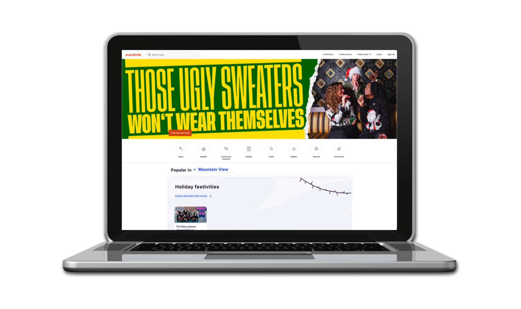
eventbrite.com
Strengths
- Very solid CTA above the fold that makes it easy to browse events.
- Popular events are nicely displayed with text and icons.
- Ability to browse events all over the world.
Weaknesses
- There is a technical error on the homepage. When a filter is selected the page refreshes and scrolls away from the content.
- The homepage offers too many filters all in the form of buttons. The website wants you to stay on the homepage but is constantly navigating me away.
events.longisland.com
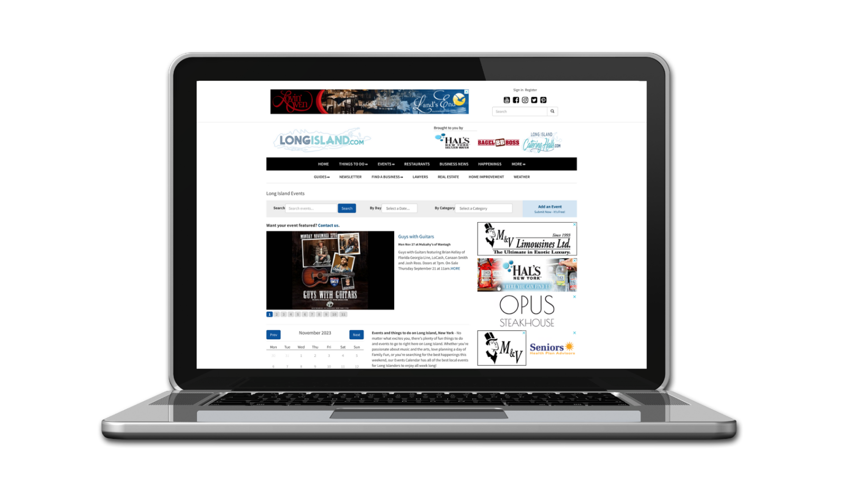
Strengths
- This website includes over 50 types of events and “things to do”
- Website includes more than just events. “all-in-one” website for all things Long Island.
Weaknesses
- There are 6 ads above the fold, but their placement feels unintentional and there is not CTA to click them.
- No major CTA, just displays a search bar.
- I feel a little bit of information overload from the layout.
Discovery
- An effective event page requires a smooth and intuitive event search functionality.
- While featuring businesses through ads is advantageous for both parties, it’s crucial to optimize these ads in a manner that benefits the business, incorporating a compelling call-to-action (CTA).
- Events should be allocated dedicated pages to provide users with comprehensive information.
Additional research into the preferences and expectations of the client’s current user base is essential to tailor the website content to meet their specific needs.
User Surveys
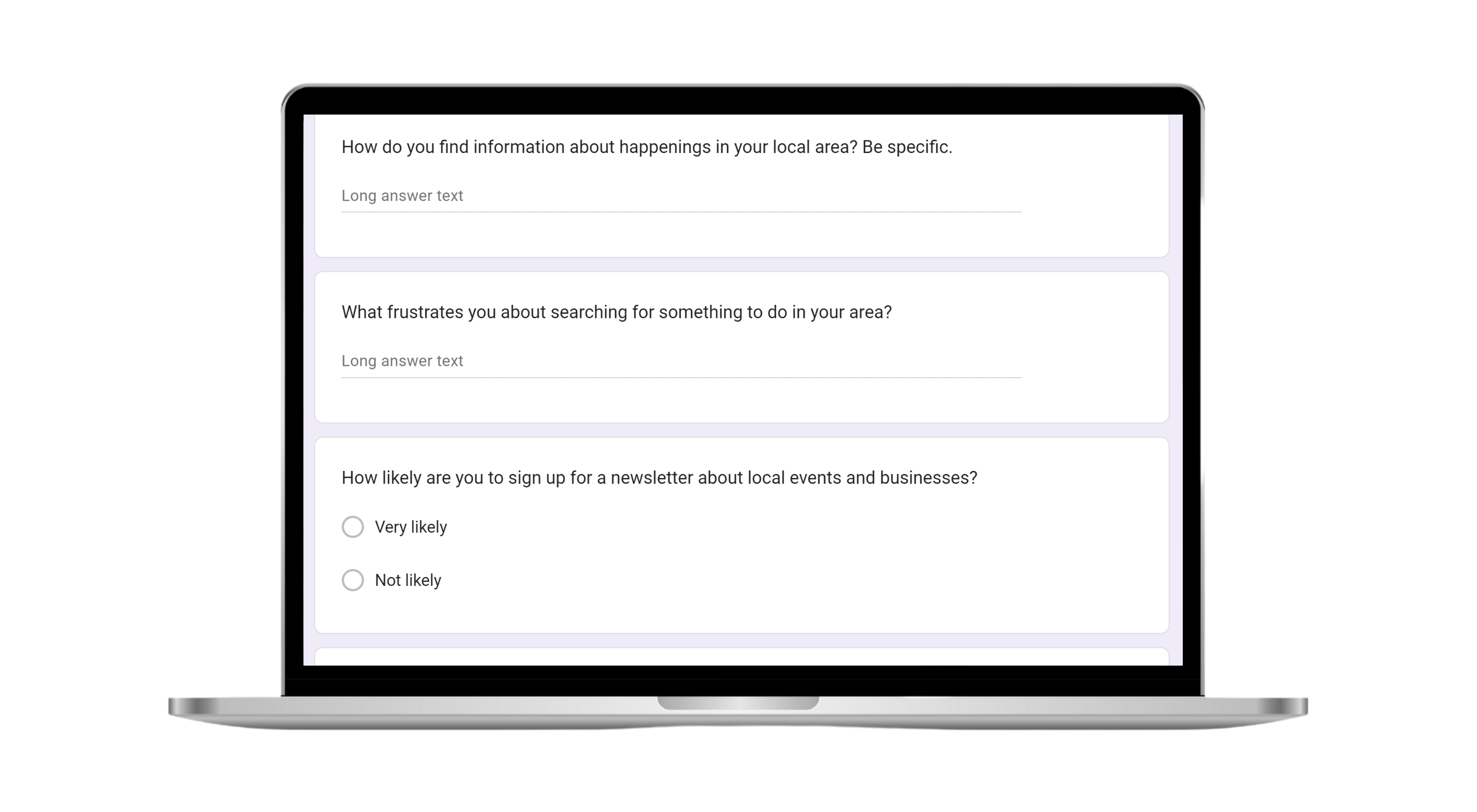
Goal
This initial survey was intended to collect information from users about what they expect from a local event website.
Participants
The client already has a large following on Instagram. I was able to recruit participants who were actively engaging with their Instagram posts and stories.
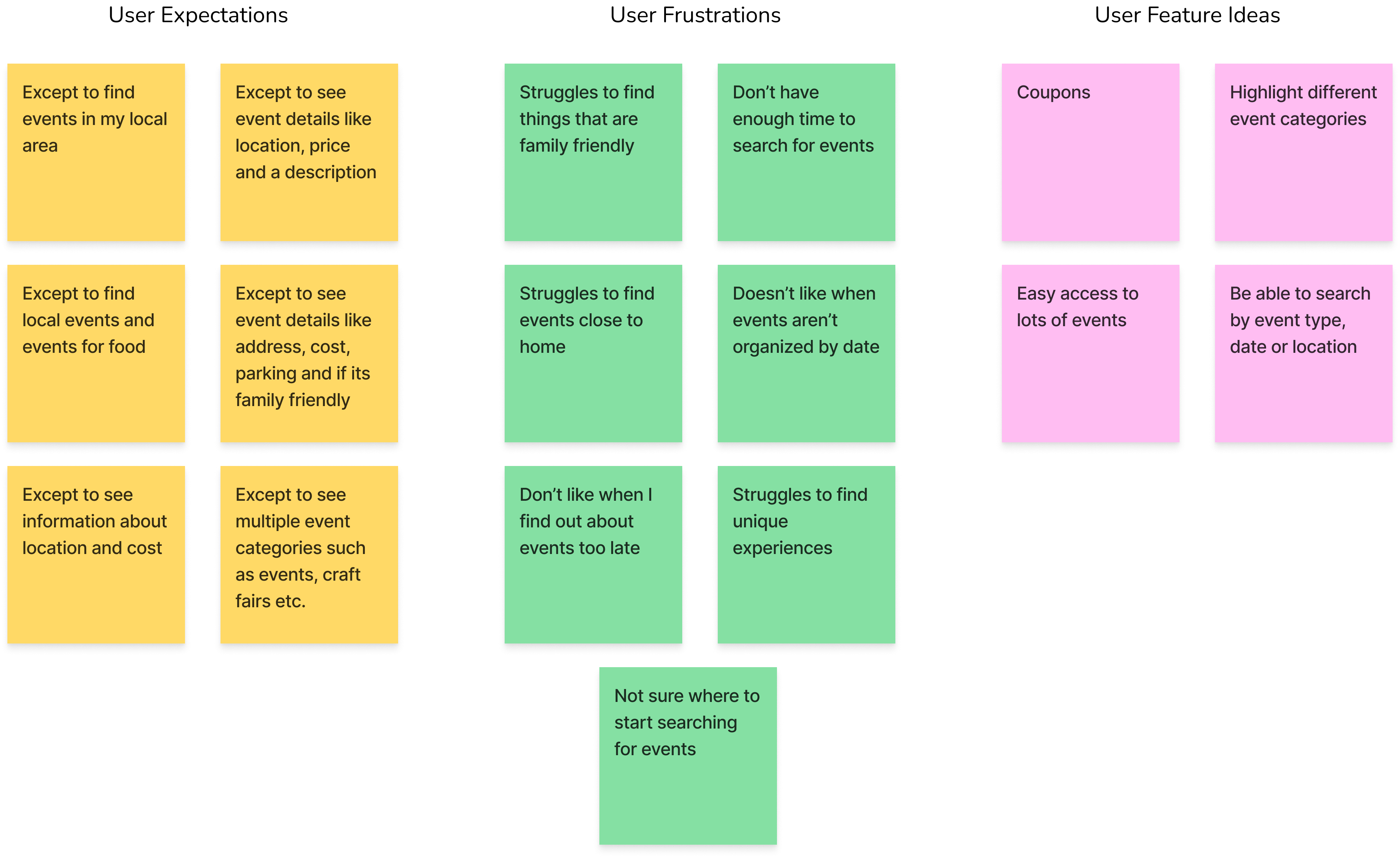
User Expectations
- Users expect information about event location, pricing, and coupons.
- Users desire the ability to search events by date, location, or category, and express interest in seeing coupons on the website.
User Frustrations
- Discovering events too late.
- Facing time constraints for searching.
- Difficulty in finding family-friendly events.
- Challenges in discovering unique experiences.
Define
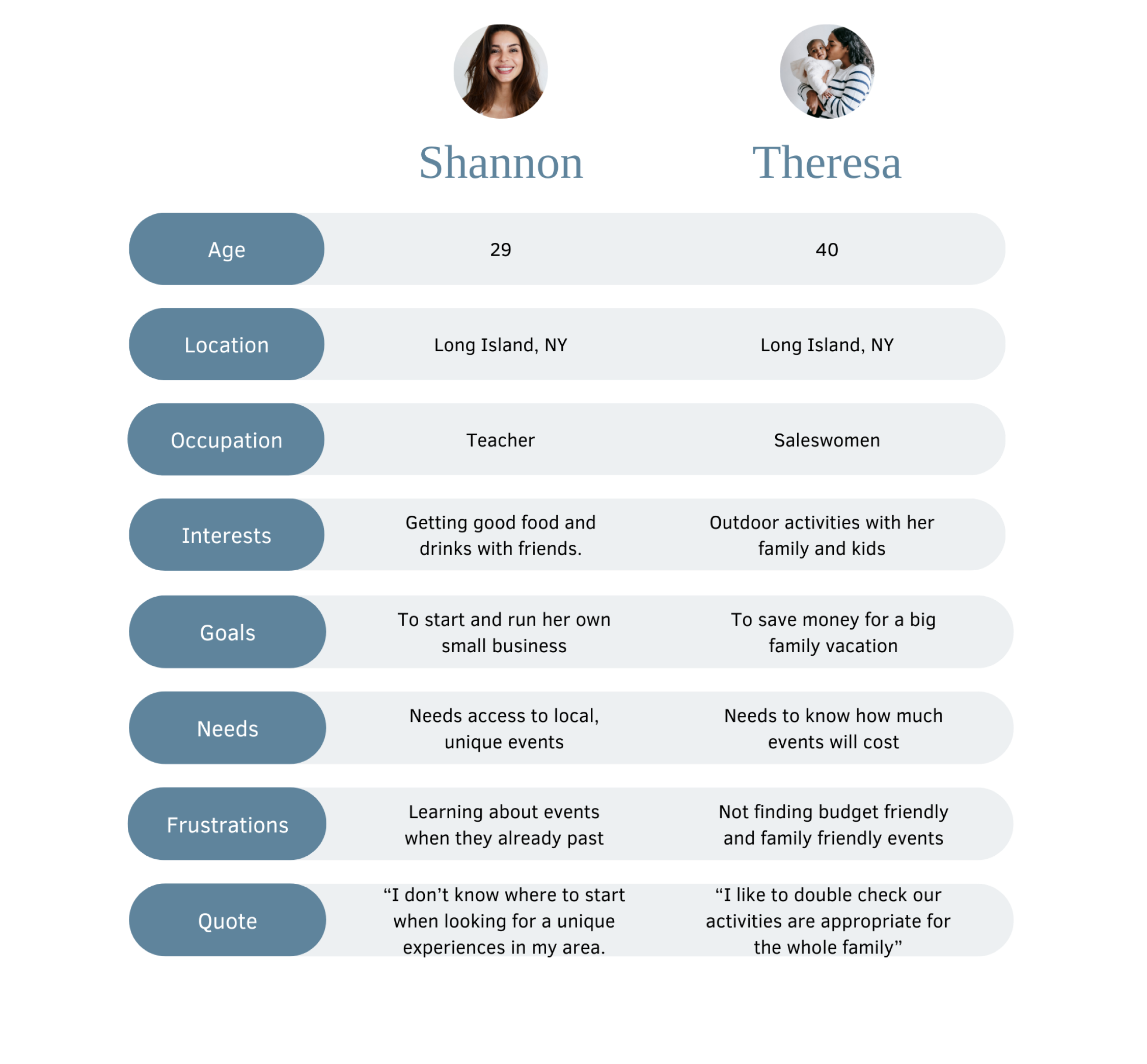
User Personas
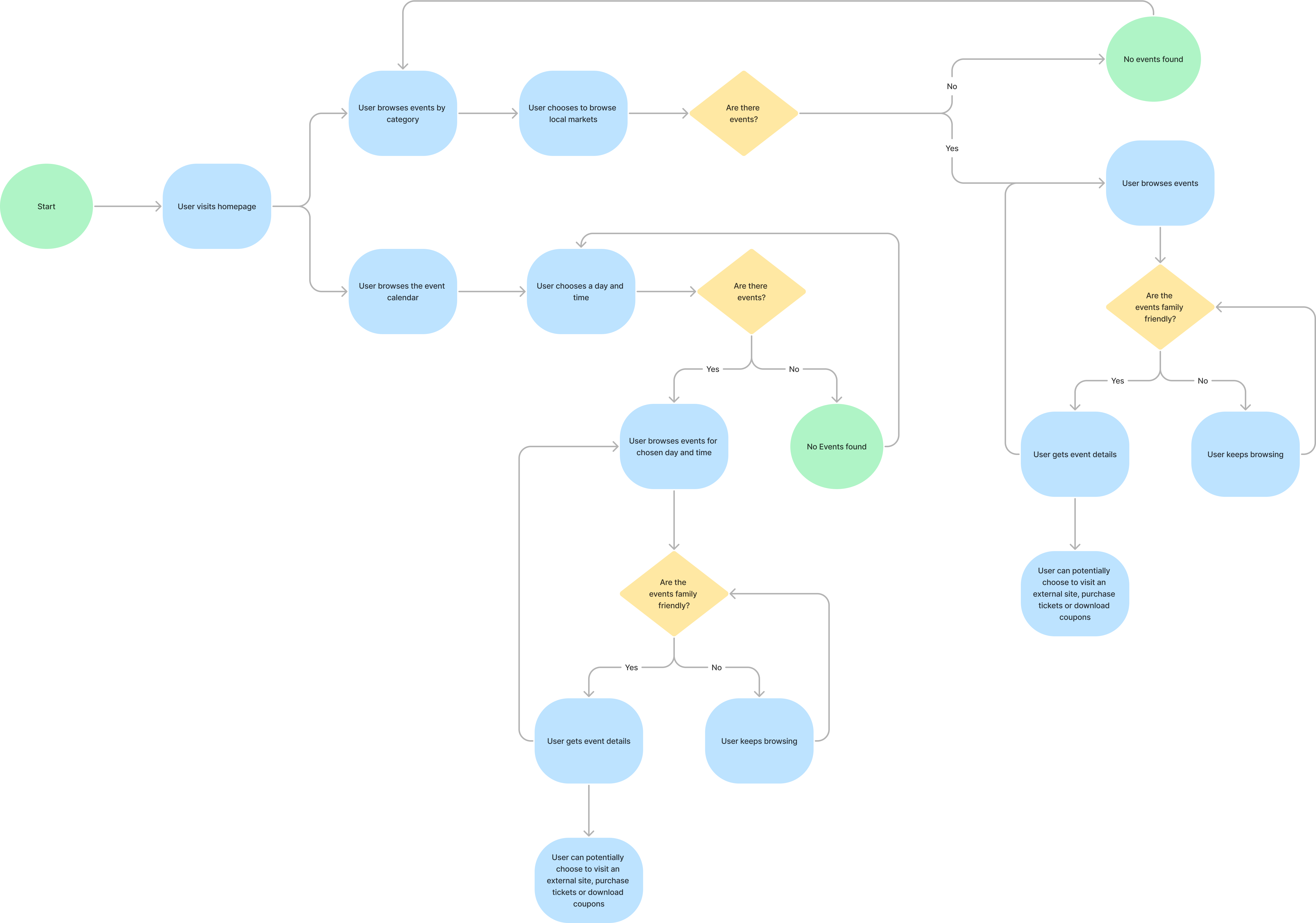
User Flows
Task
Theresa wants to search for family-friendly events to do with her family this weekend.
Ideate
Low Fidelity Wireframe
Prototype
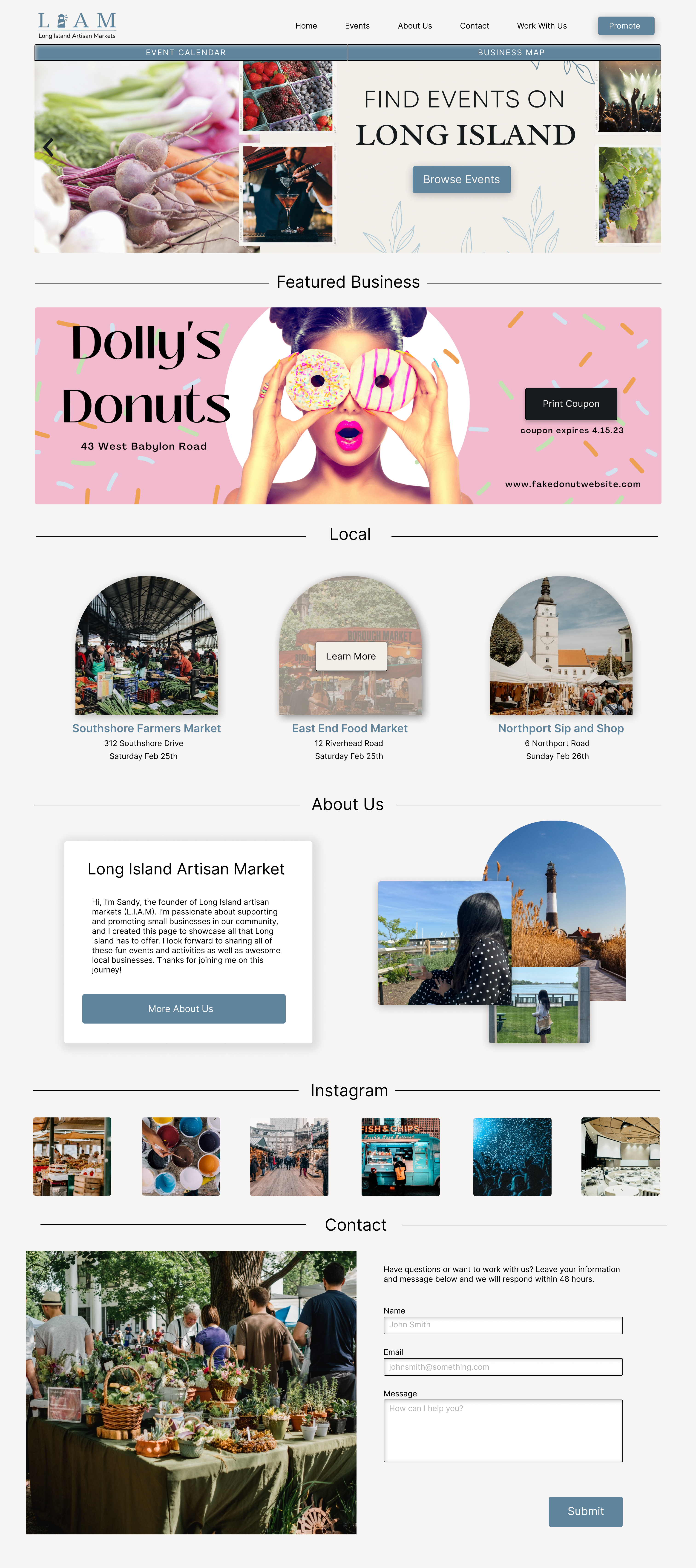
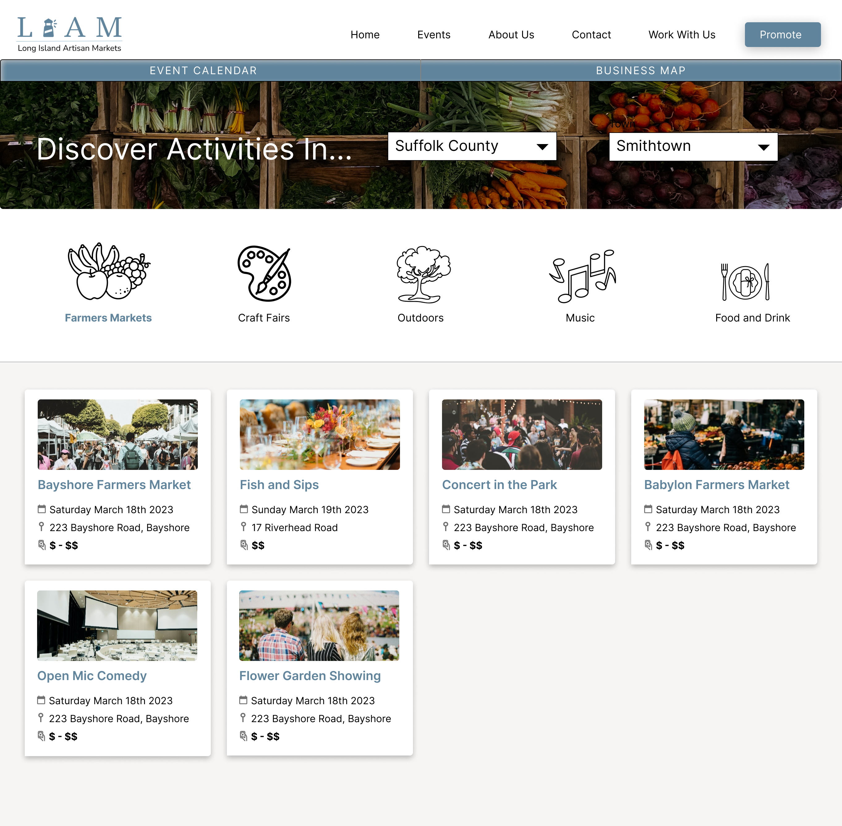
High Fidelity Wireframe
Homepage
Event Page
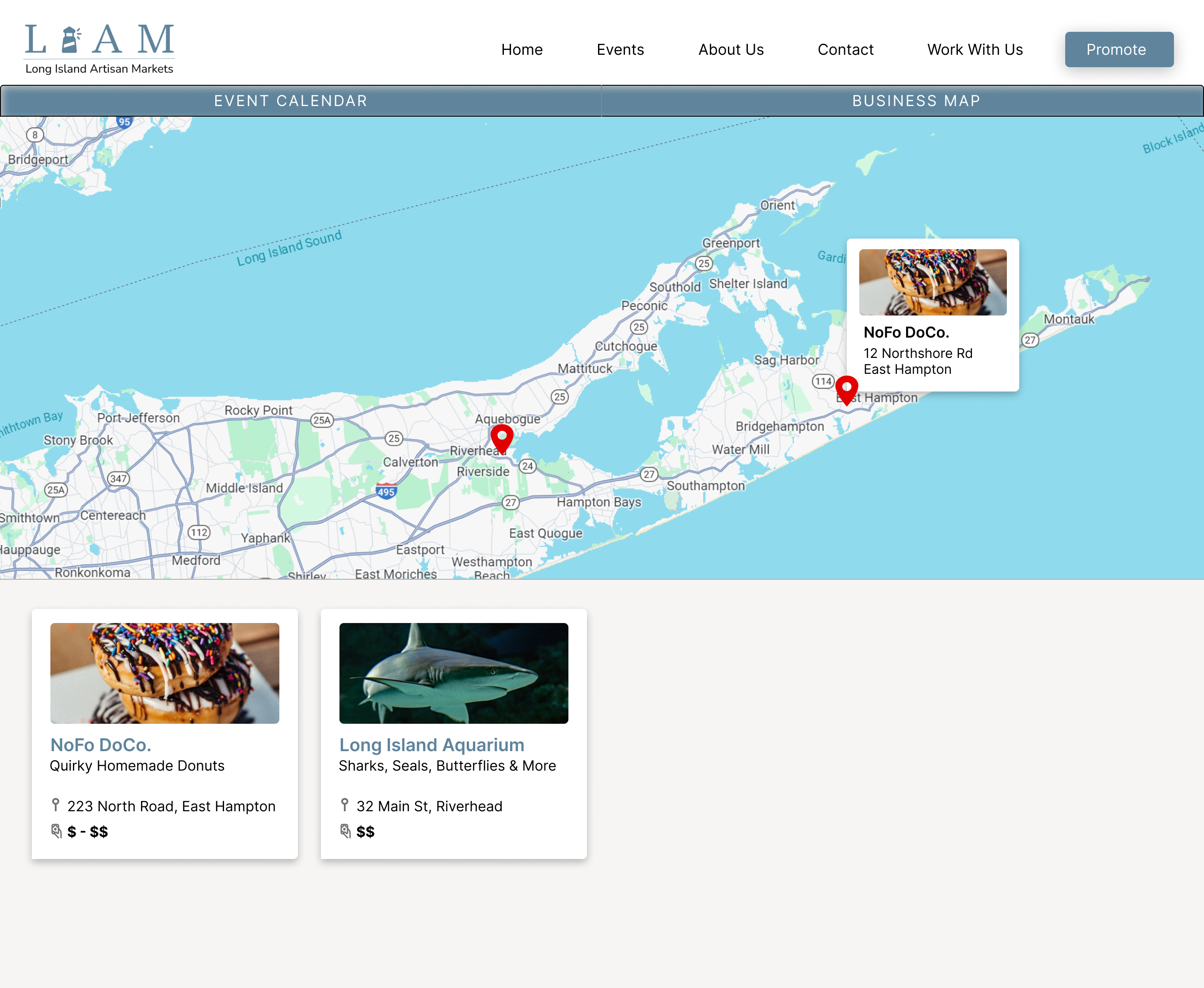
Business map
Test/Revise
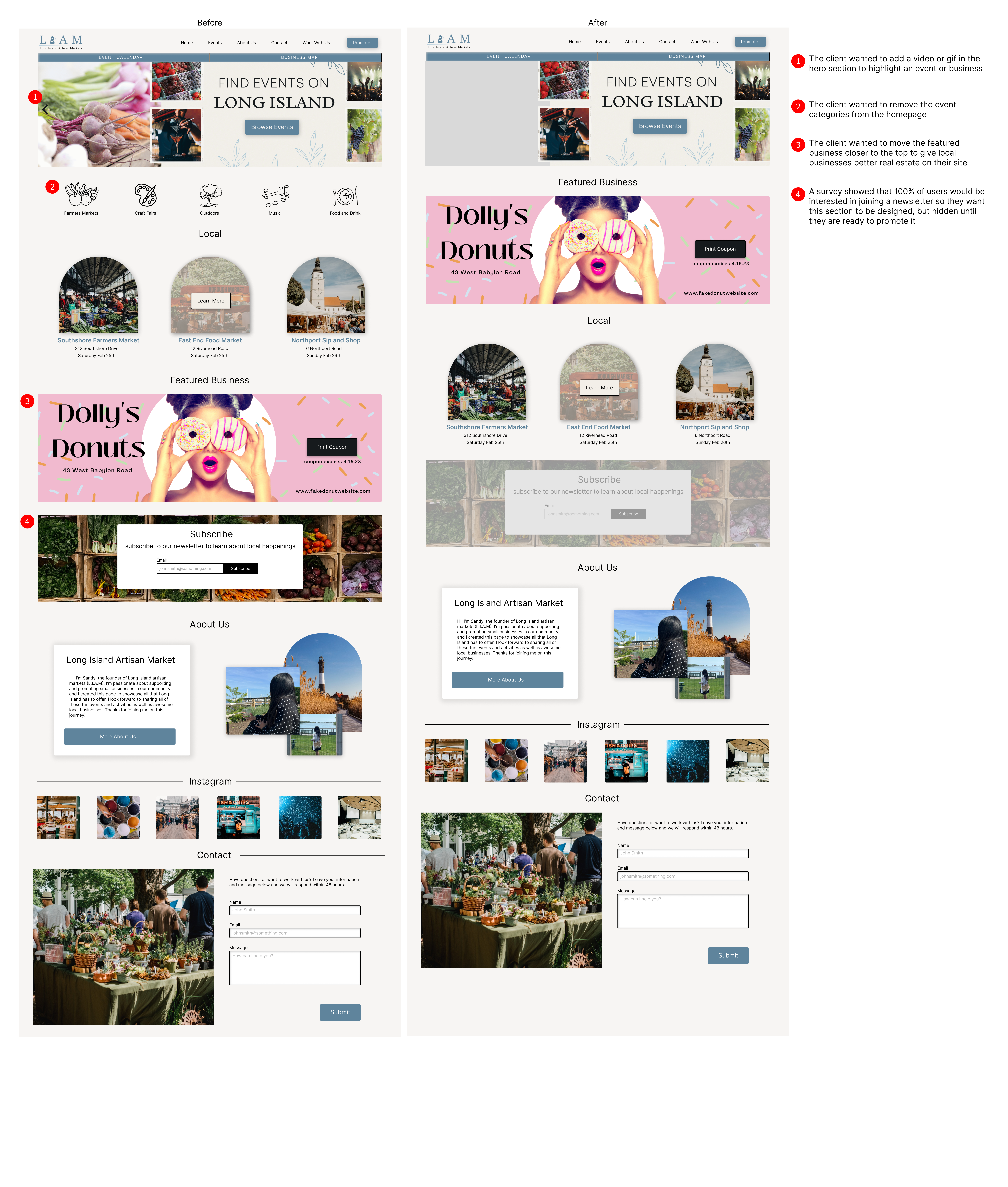
Iterations
Preference Test
Goal
I wanted to ask the users how they prefer to have their event information displayed.
Participants were asked to choose which card layout was the best based on clarity, ease of use, and appeal.
78% of users chose Option B because…
- “You’re able to view more on one page”
- “More aesthetically pleasing. I’m able to see more options at one glance”
- “The formatting of the boxes & information keeps it concise and easy to read”

Reflection
Through my journey on this design project, I gained some valuable insights. Wearing the hats of both designer and developer, I found that my development skills sometimes put constraints on my design ideas. It was a real eye-opener to see how certain aspects of the design had to evolve due to the quirks of web development plugins. This hands-on experience taught me the delicate dance between design aspirations and the practicalities of implementation. Learning to navigate these challenges underscored the importance of collaboration, where the magic happens when the designer’s creativity meets the developer’s technical finesse.
Let’s Get in Touch
