Vela
Weather App
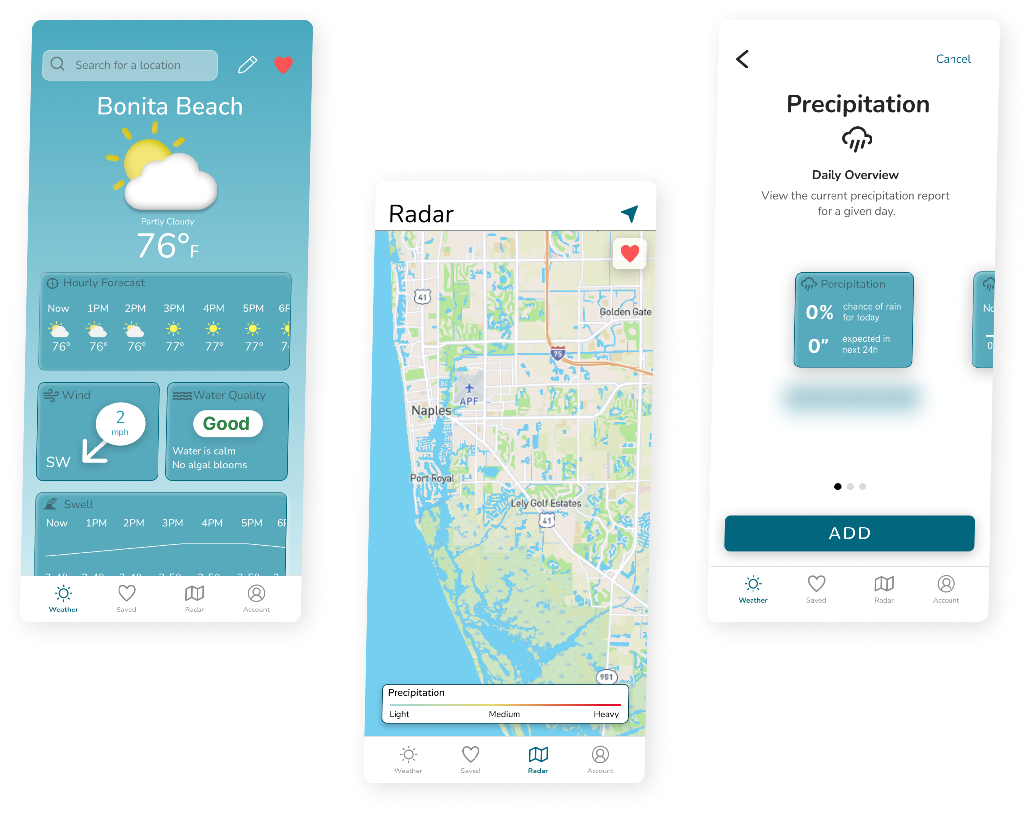
Users of Vela have complete control over how they view their weather. No more scrolling through unnecessary data. Users can customize each weather page to suit their needs.
Overview
I was tasked to research, design and prototype Vela, a weather app for water enthusiasts. It was imperative that the users of Vela felt confident when choosing to spend the day on the water.
My Role
Solo designer tasked with conducting and analyzing user research, sketching wireframes, designing prototypes, and testing prototypes.
Problem Statement
Our users are people who participate in water activities. They need to be able to check particular weather conditions that they need and don’t want to look at weather data that does not pertain to them because it’s a waste of time.
Design Thinking
Emphasize
- Competitive Analysis
- User Interviews
Define
- User Personas
- User Flows
Ideate
- Wireframes
Prototype
- High Fidelity Prototype
Test
- Usability Test
- Preference Test
- User Surveys
Emphasize
Competitive Analysis
I performed a SWOT analysis to determine the strengths and weaknesses of the competition.
TideCharts
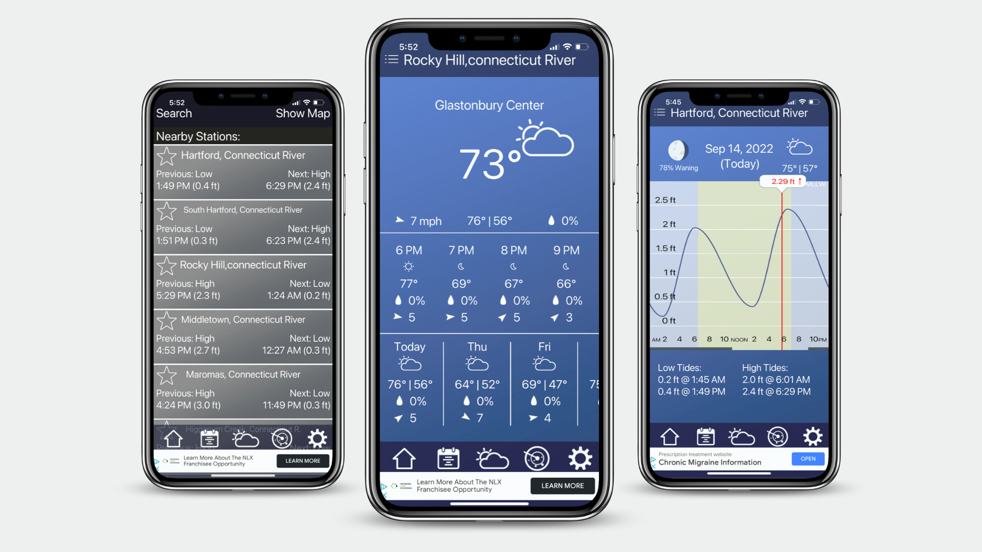
Strengths:
- Can be used without an internet connection.
Weaknesses:
- UI for data is confusing and hard to read.
Buoycast
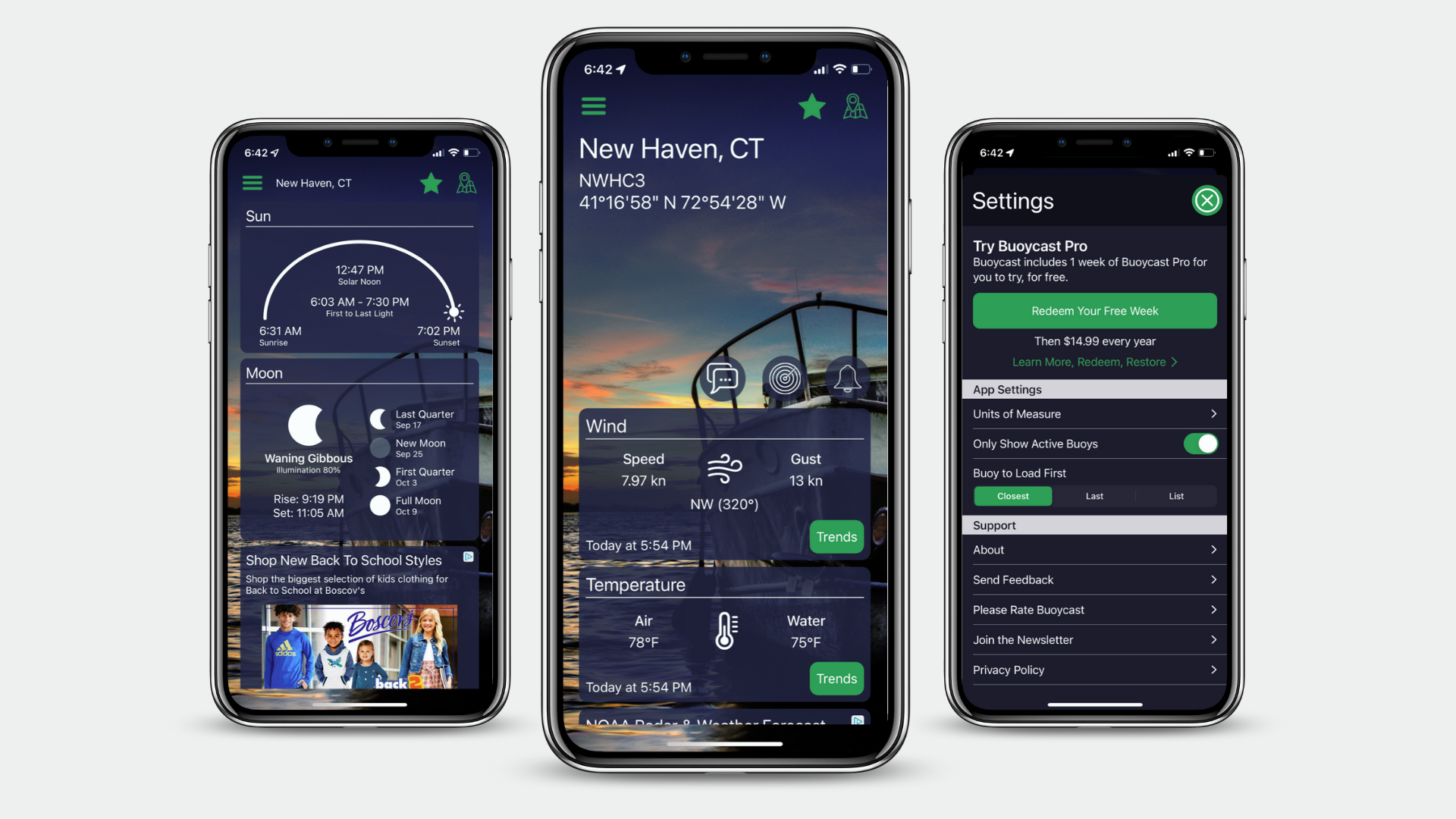
Strengths:
- The app provides weather and storm alerts.
Weaknesses:
- The weather radar is only available in the paid version.
- No navigation in the app. Everything is on the homepage, so you must scroll through the information to get to what you need.
Opportunities for Vela
- If Vela uses clean and organized UI it will have more opportunities than this competitor
- Vela will utilize a navigation bar for faster navigation and better organization.
- Vela will organize weather data by category, allowing users to see the data they want.
User Surveys
To better understand potential users of Vela, I interviewed five users through in-person and remote interviews.
The main goal of this research was to determine…
- What are people’s daily habits
- What weather apps users were currently using
- What are their pain points and frustrations with their current apps
Participants said…
“My current weather apps are pretty accurate”
“It’s annoying to scroll through weather data I don’t need”
“I will usually plan my Saturday fishing trips on Monday”
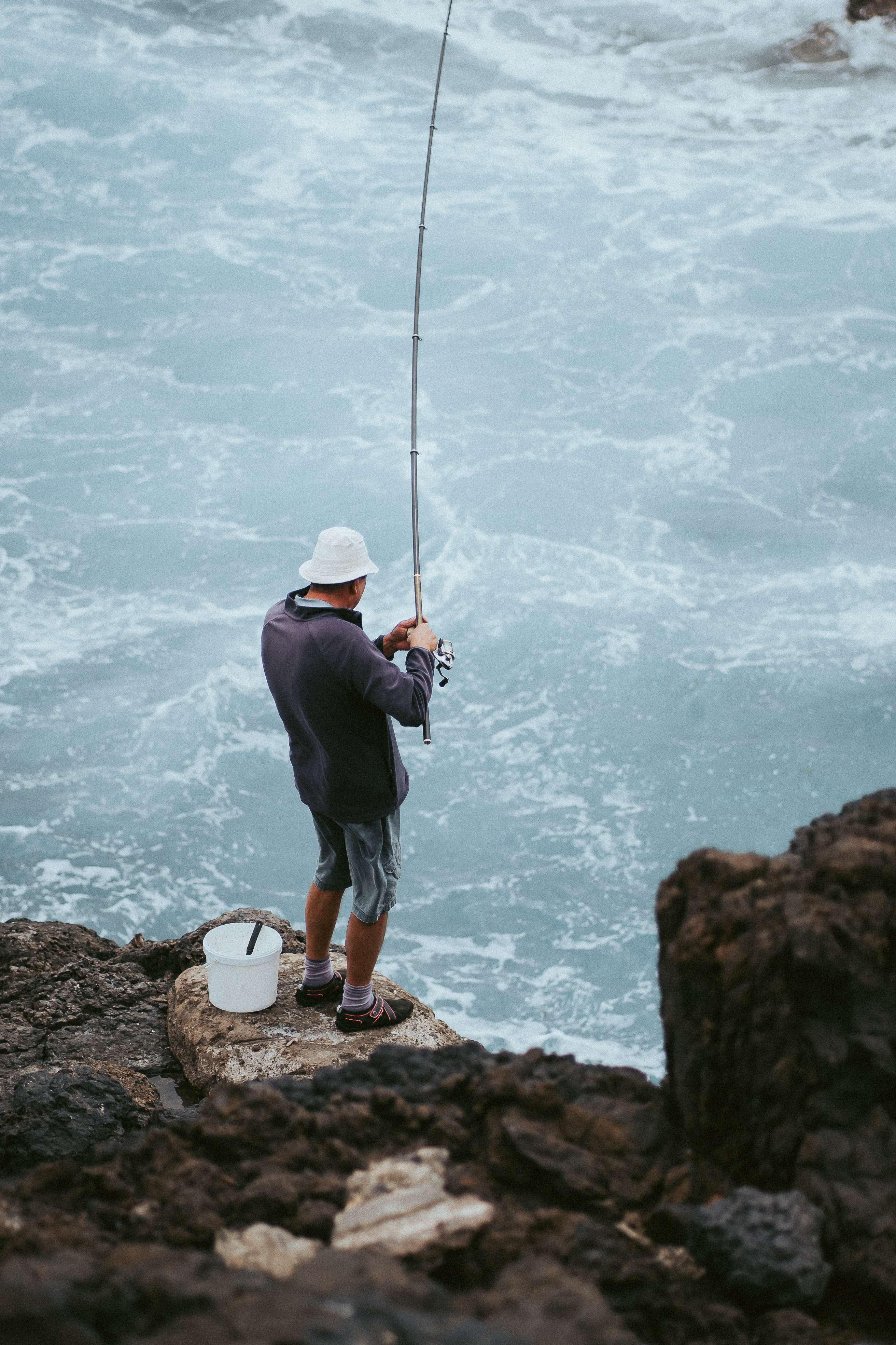
"My current weather apps are pretty accurate"
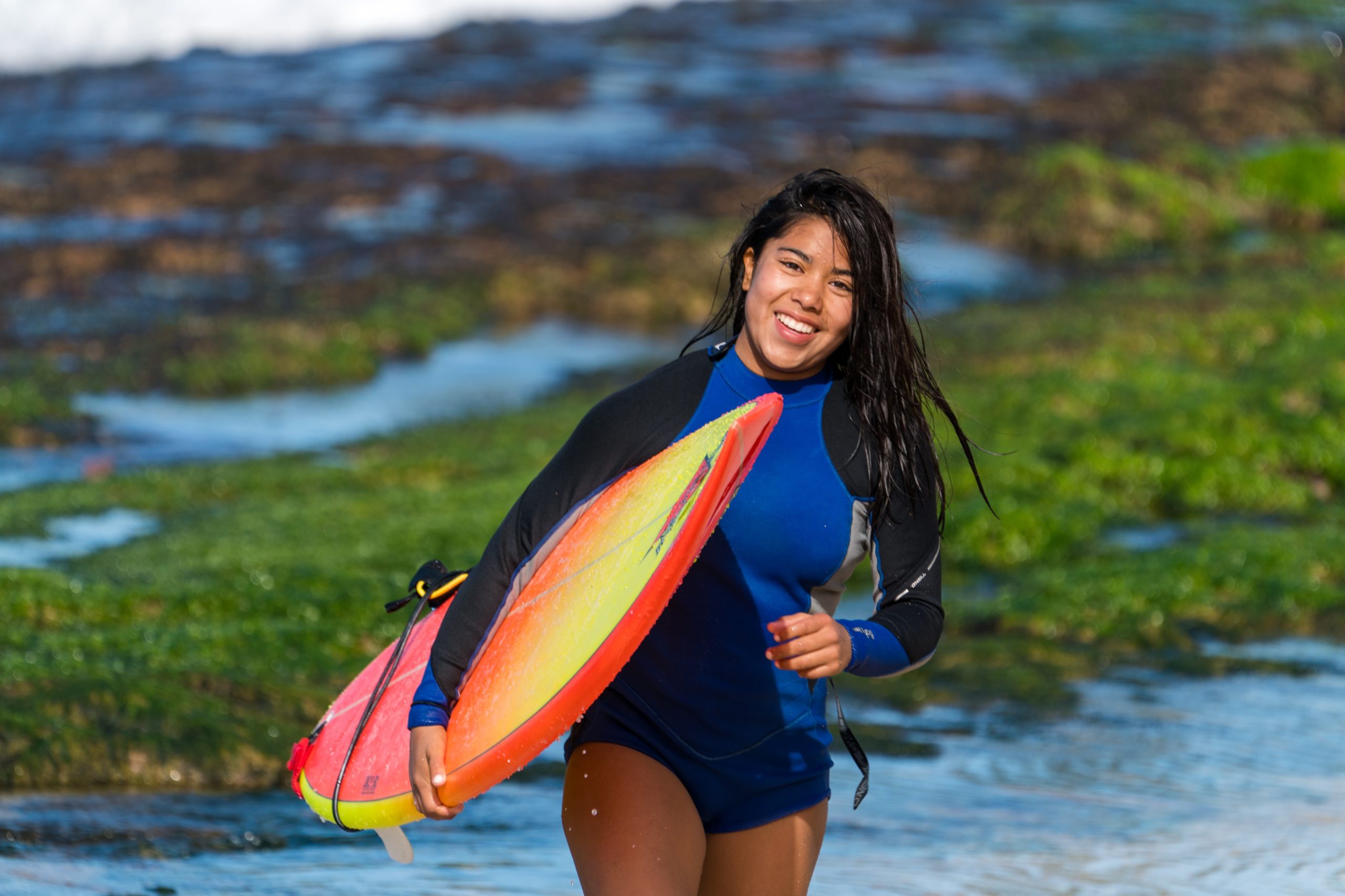
"It's annoying to scroll through a lot of weather data"

"I will usually plan my Saturday fishing trips on Monday"
All the users mentioned using apps that they found reliable. This means it would be more difficult for Vela to compete.
Three users mentioned that scrolling through weather data that didn’t pertain to them was bothersome and a waste of time.
Every single participant mentioned planning trips in advance.
Using the participant’s habits and pain points, I started to think about possible solutions and ways that Vela could stand out amongst the competition.
Define
User Personas
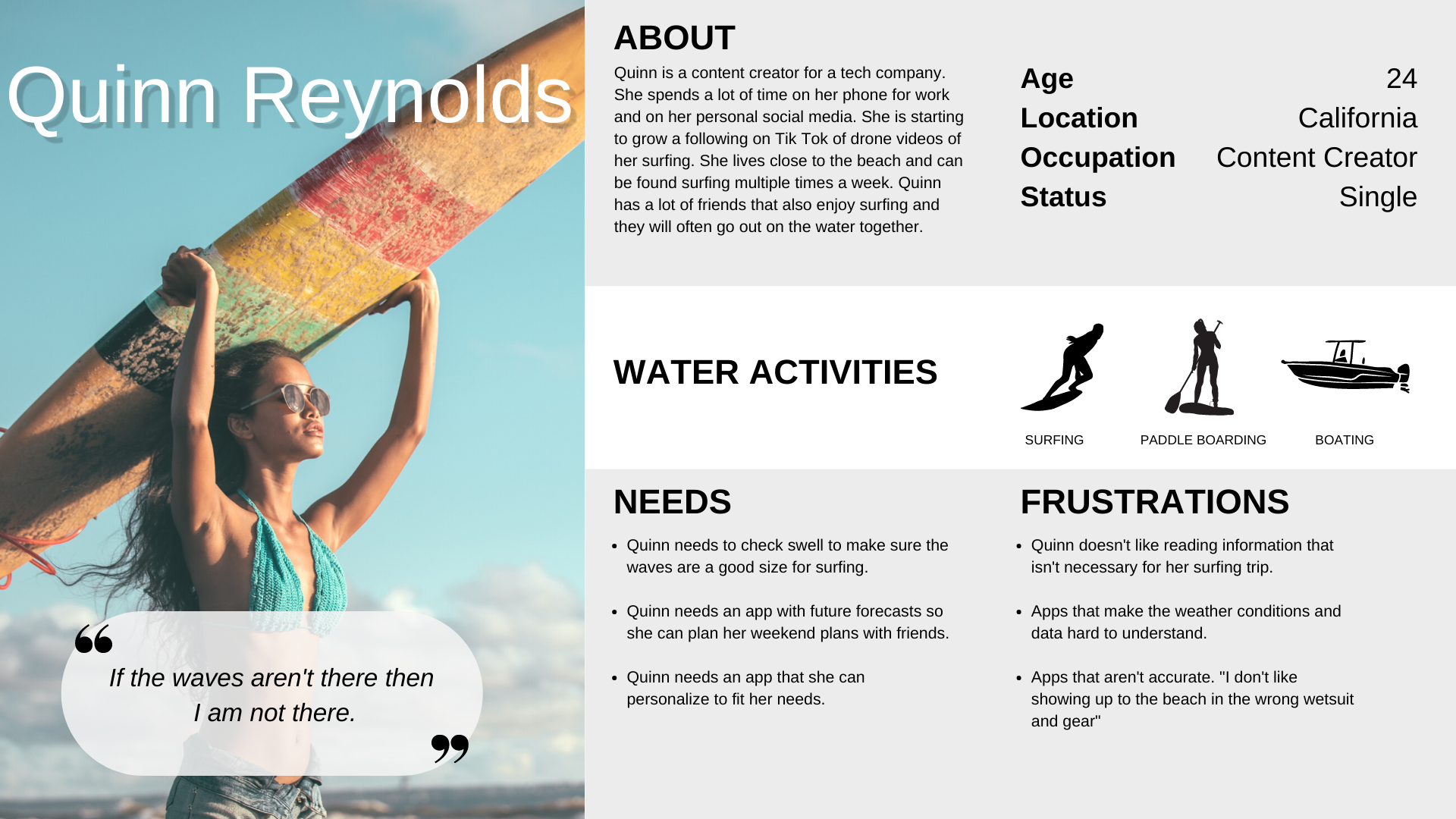
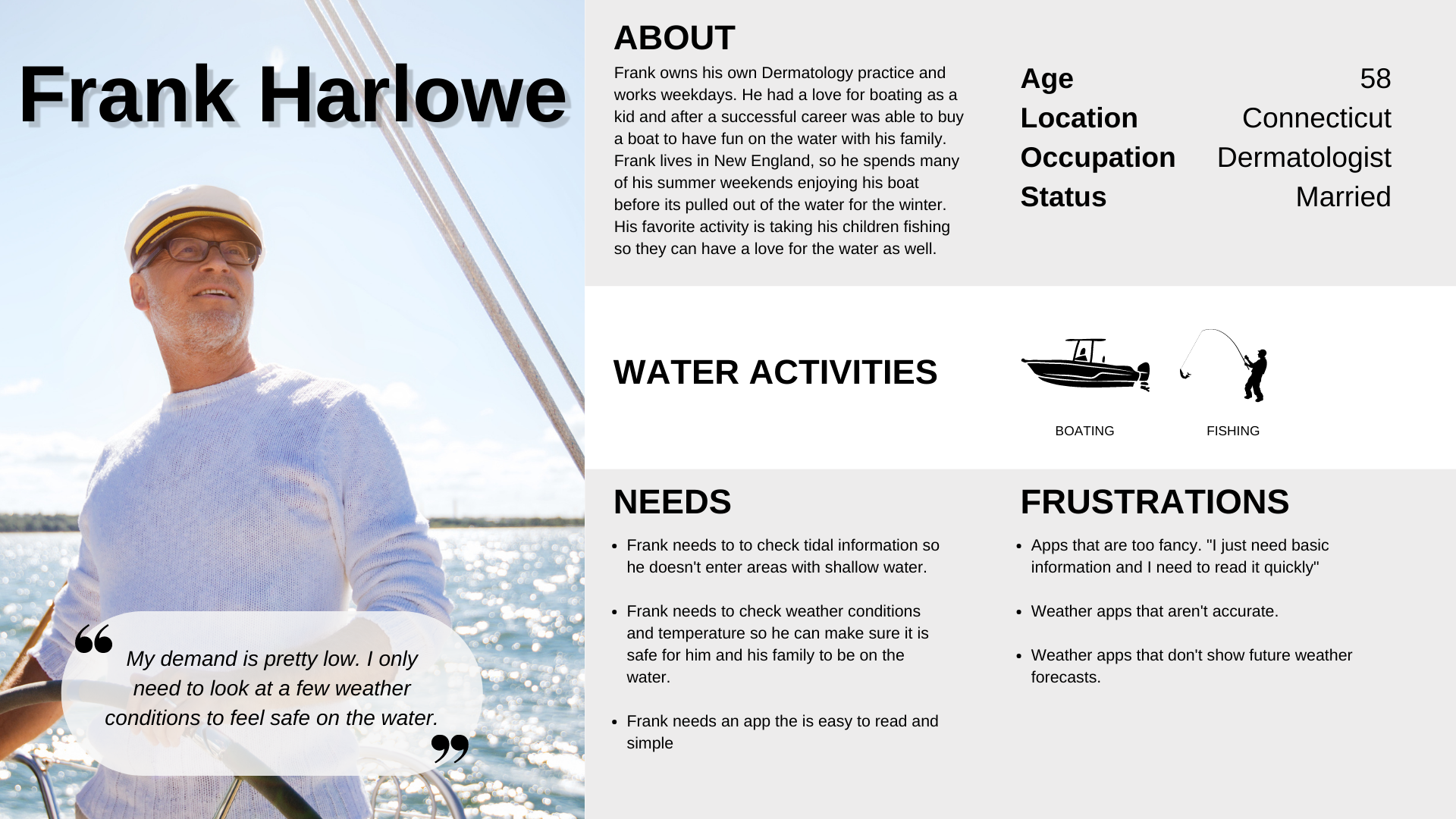
I used the information from the user research to create two personas that encompass the wants, needs, and motivations of my users.

User Flows
After I determined who my main users were I was able to start defining what their time in Vela would look like. Why are they opening Vela? What should they expect when they open the app?
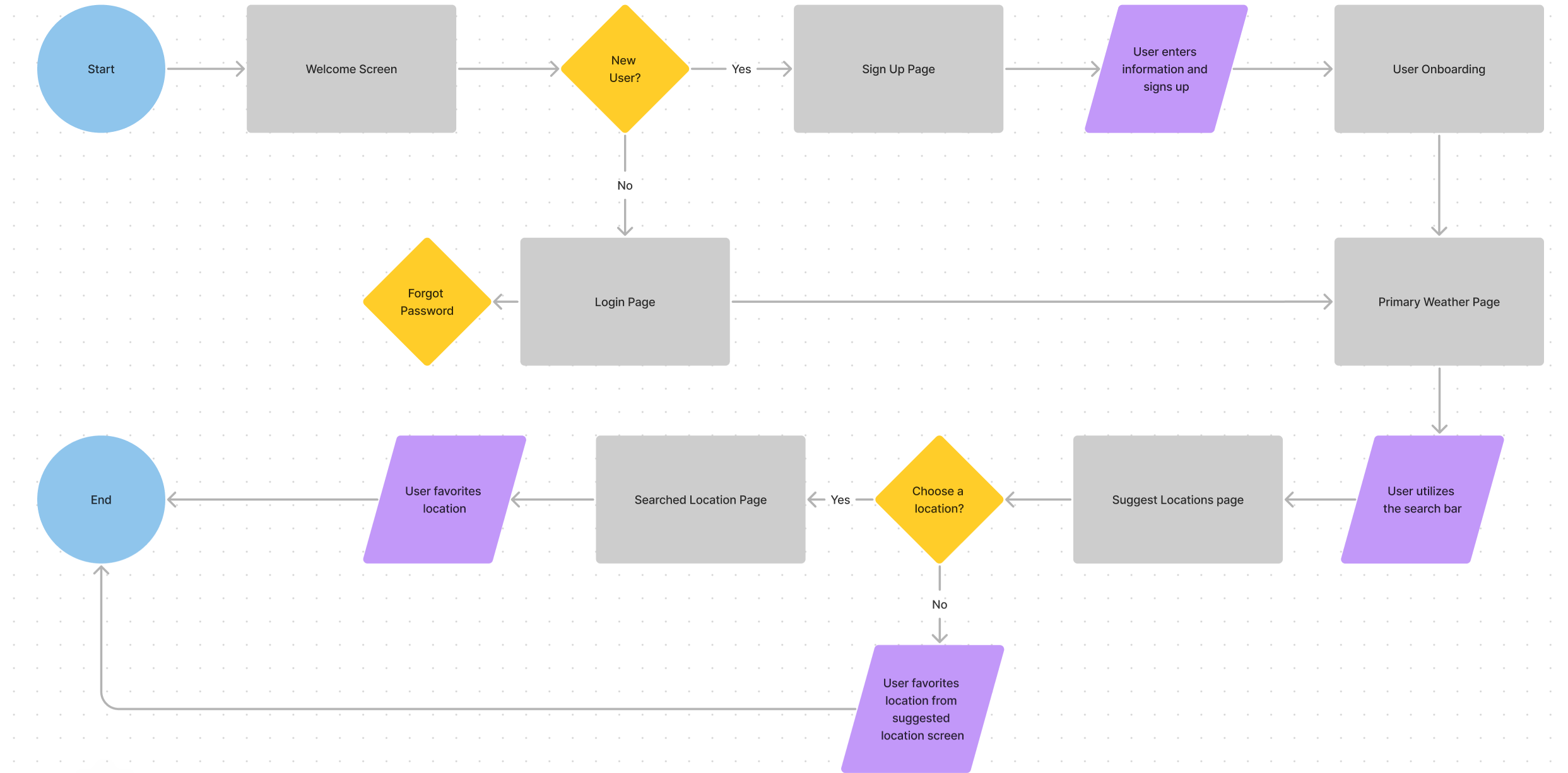
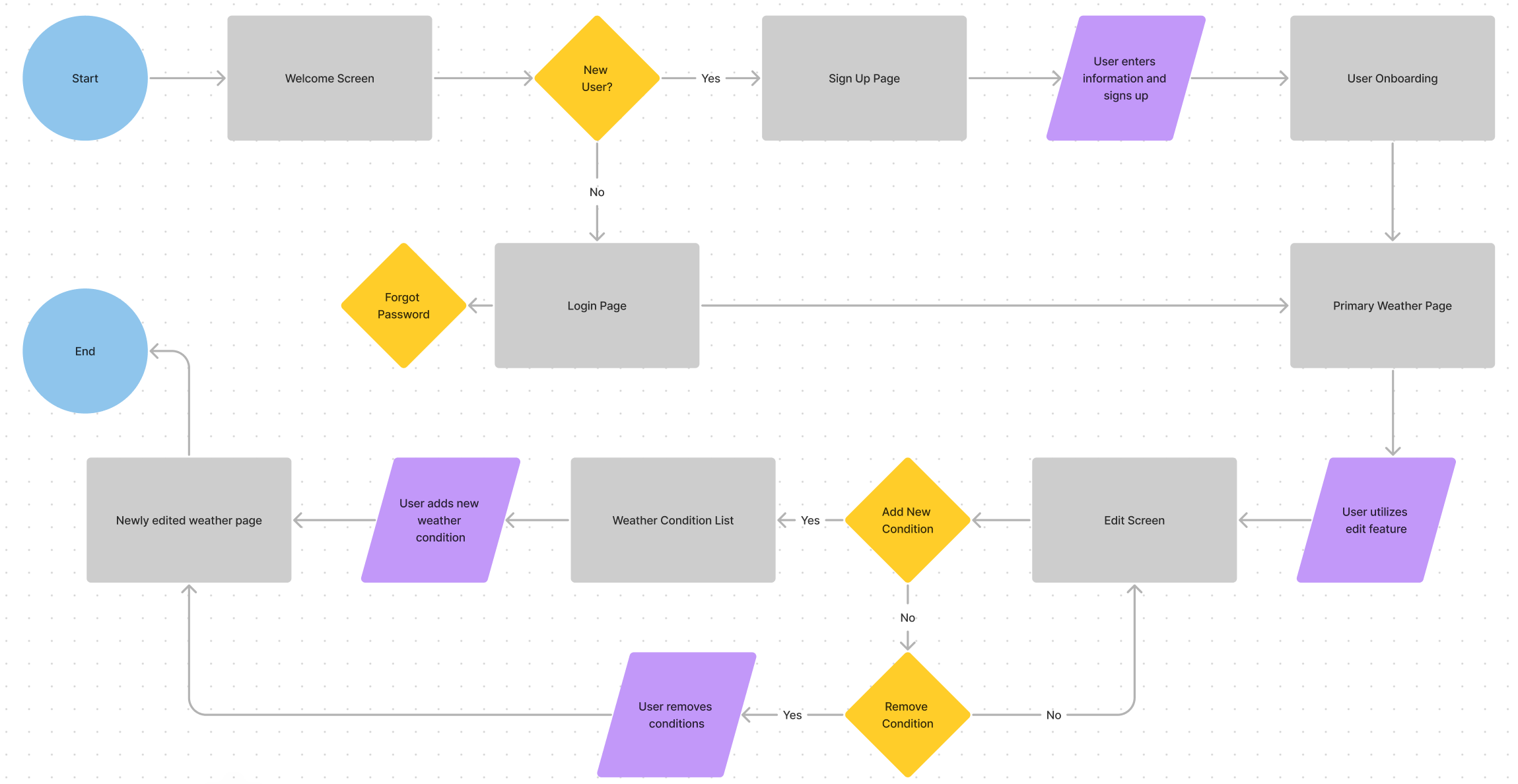
My user flows helped answer these questions. I referenced my user flows throughout the entire design process because I wanted to ensure all users could easily complete the same tasks that Quinn and Frank wanted to complete
Frank wants to save new locations to his favorites so he can access the weather information quickly.
Quinn likes to surf at Venice Beach, but her current weather page shows no information about the swell.
Quinn wants to add swell information to her weather page.
I defined my users and formed my problem statement. Cementing in a problem statement allowed me to evaluate possible solutions to further explore through wireframes.
Problem Statement
Our users are people who participate in water activities. They need to be able to check particular weather conditions that they need and don’t want to look at weather data that does not pertain to them because it’s a waste of time.
Possible Solutions
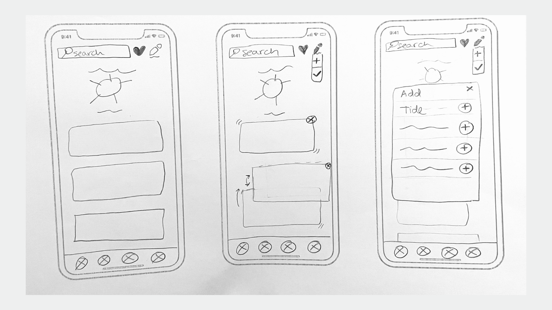
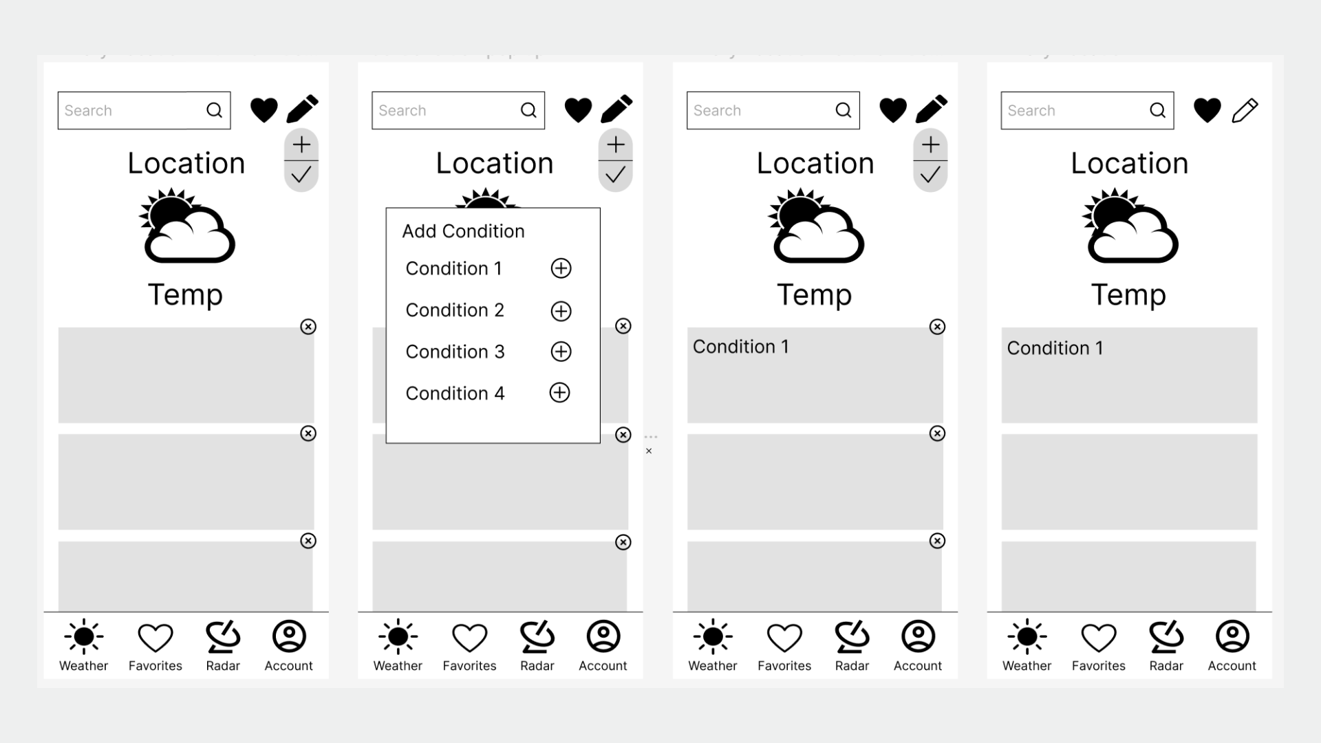
1. Create an editing feature so users can add, or remove weather data as they choose
2. Let users plan outings so they can be notified of upcoming weather conditions
Ideate
Wireframes
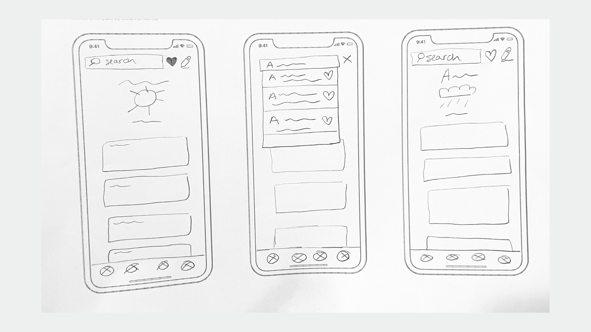
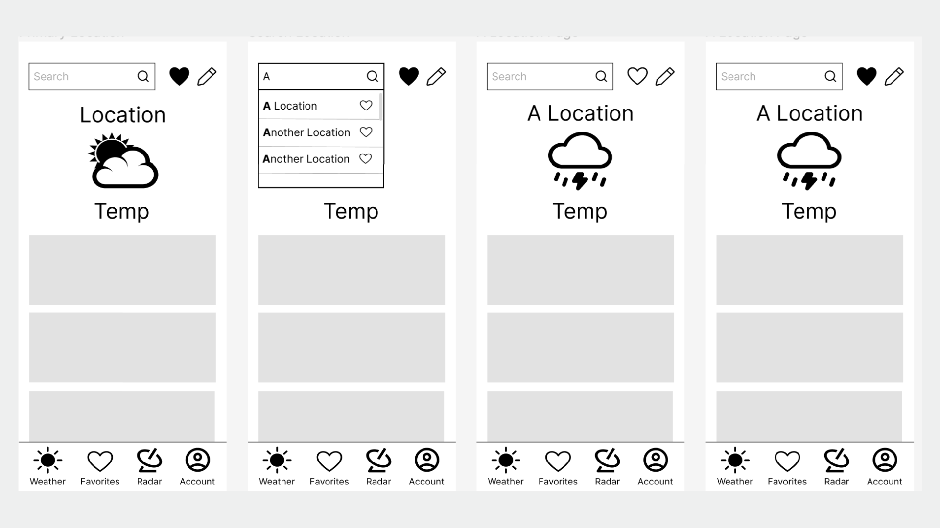
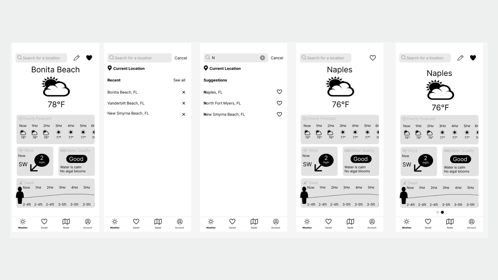
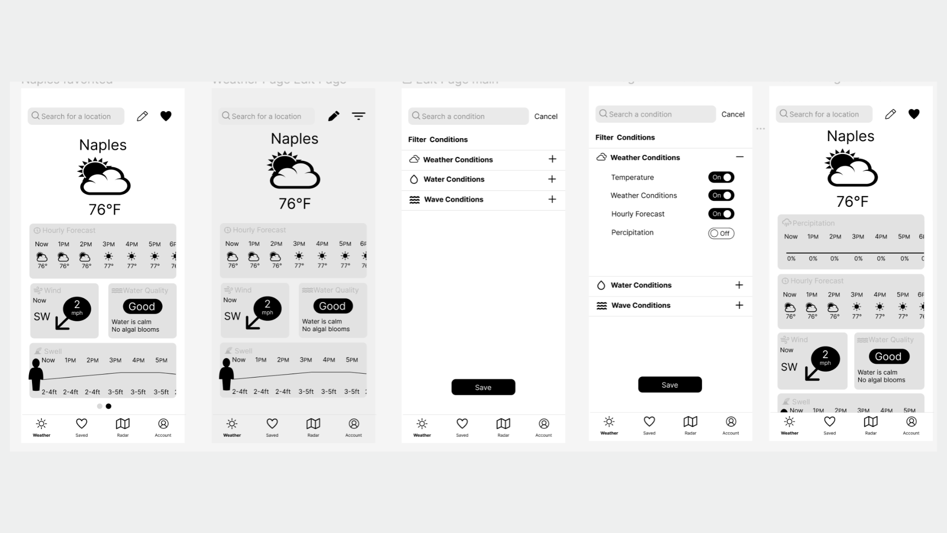
Wireframes were created to start to flesh out Vela and to experiment with ways to solve user paint points
Search and Favorite
Edit Feature
Test
Usability Tests
After the mid-fidelity wireframe was created, I was ready to start usability testing. I tested the mid-fidelity wireframe on six participants through in-person and remote usability tests.
The goal of this usability test is to determine the ease of use of the app. I want to ensure Vela has a familiar feel and that users can benefit from the customization features.
Below are the direct quotes and notes from the usability tests.
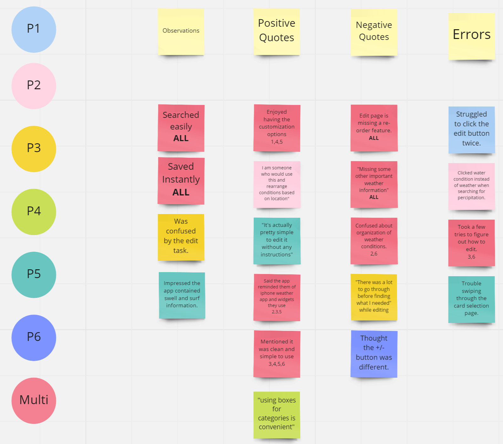
One issue that multiple participants had problems with was the layout of the weather condition selection page. One user thought the organization of the categories needed work. Another user thought there were too many pages to flip through before completing the task.
In my original design, I had it organized by words. I re-designed this page to make it easier to understand and look at.
To determine which design users enjoyed, I set up a preference test.
Preference Test
For Vela to solve my problem statement it needed to offer an easy-to-use customization feature. I created a new design for the customization feature and did a preference test to see how users preferred to have their information organized.
I asked ten participants to tell me which screen they liked better and why.
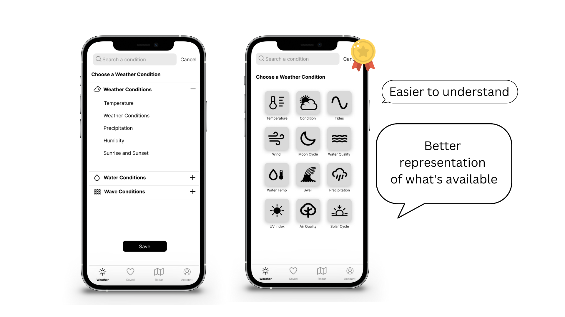
9 out of 10 participants chose the pictogram version over the text version.
Users mentioned that the pictograms were easier to understand, looked cleaner, and could display all the information on the same page.
The preference test was a great quick way to validate a new design decision.
User Surveys
Above I noted that users don’t want to see weather conditions that don’t apply to them. Creating an editing feature so users can add or remove conditions as they please is one of my possible solutions.
I decided to take this one step further and conduct a survey to find correlations between water activity and weather conditions. With this information, I can have users select their favorite water activity and automatically preload the app with the information they want to see.
I surveyed with sixteen participants.
The survey asked participants what water activities they participated in and then asked them to rate a variety of weather conditions from most important to least important.
The survey helped me understand which weather conditions were considered useless to a particular group.
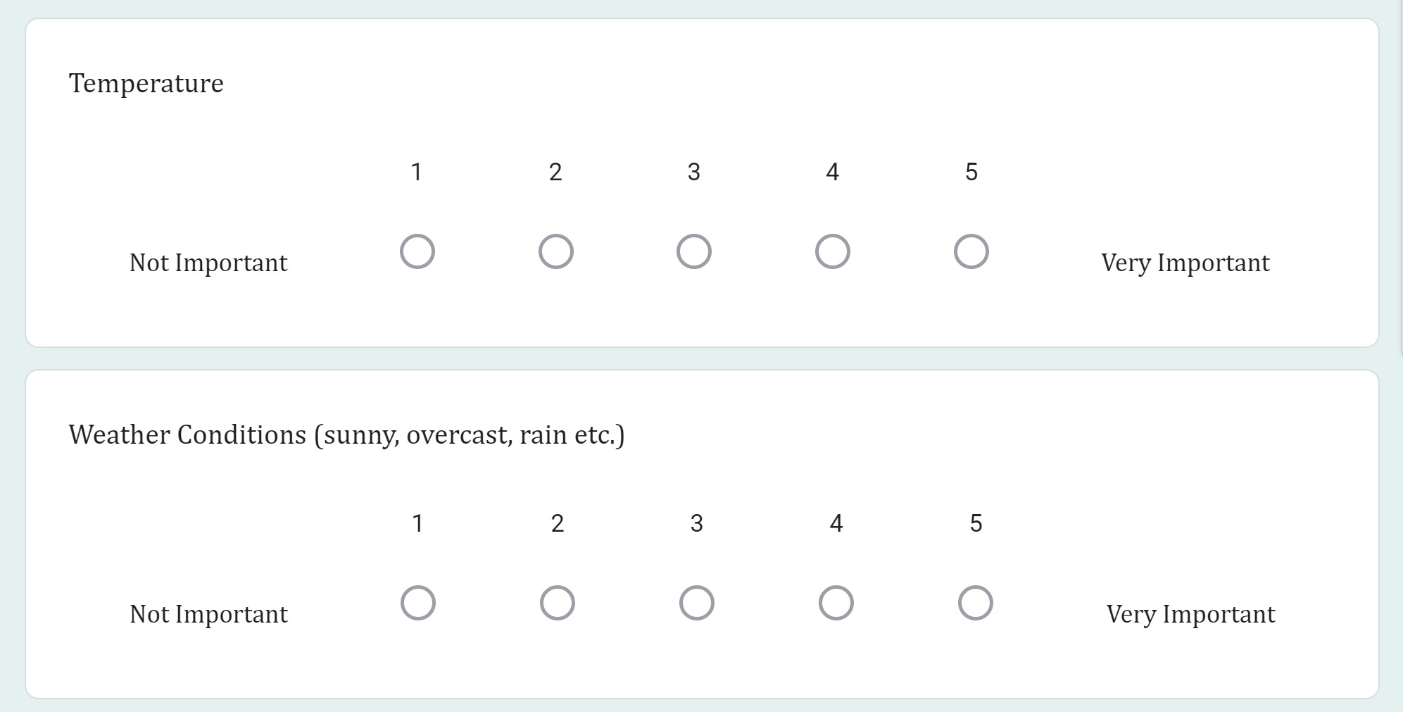
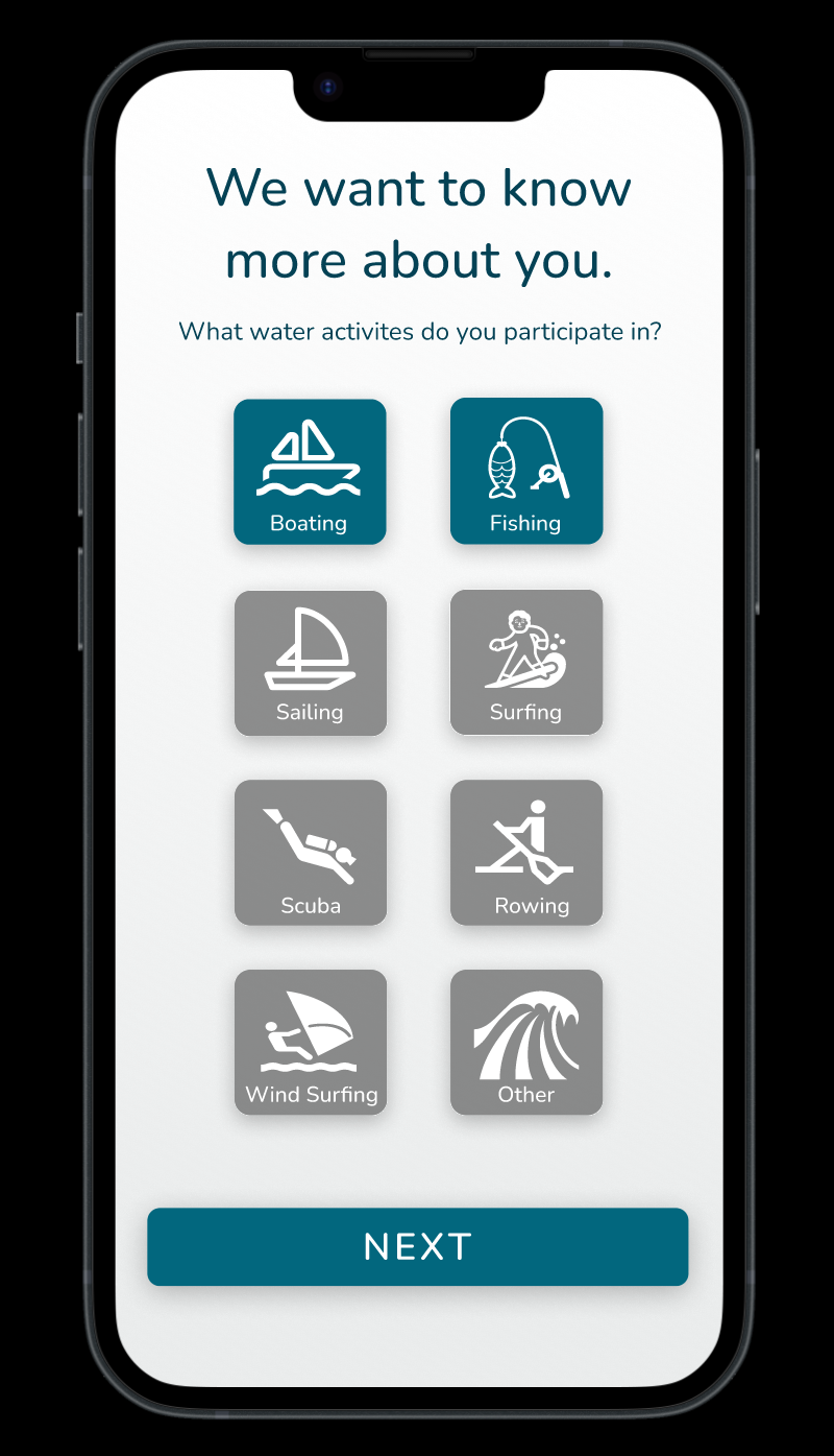
When users choose to complete the onboarding process they will be asked what water activities they participate in. Their answer will automatically set up their weather page to include the weather conditions that are important for that activity as found in the survey.
Prototype
High Fidelity Prototype
After completing user testing, I was ready to focus on the product’s UI.
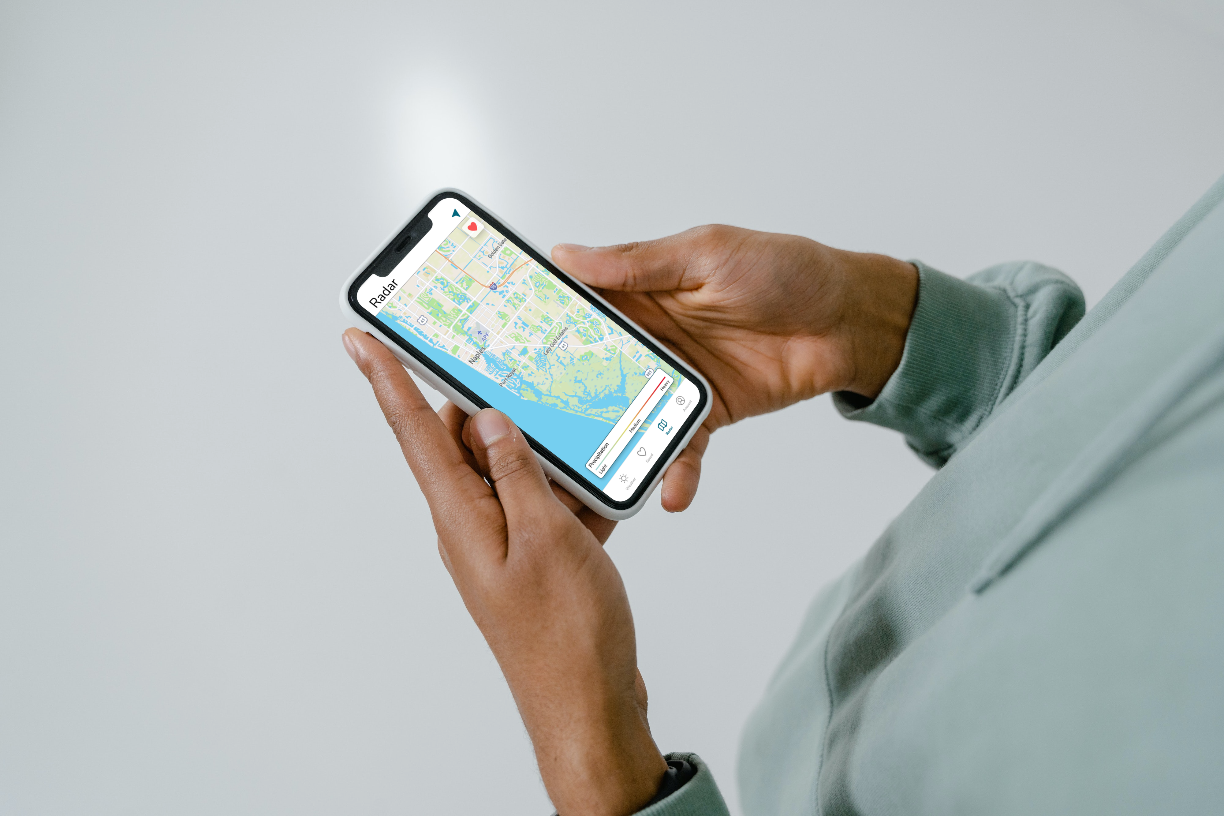
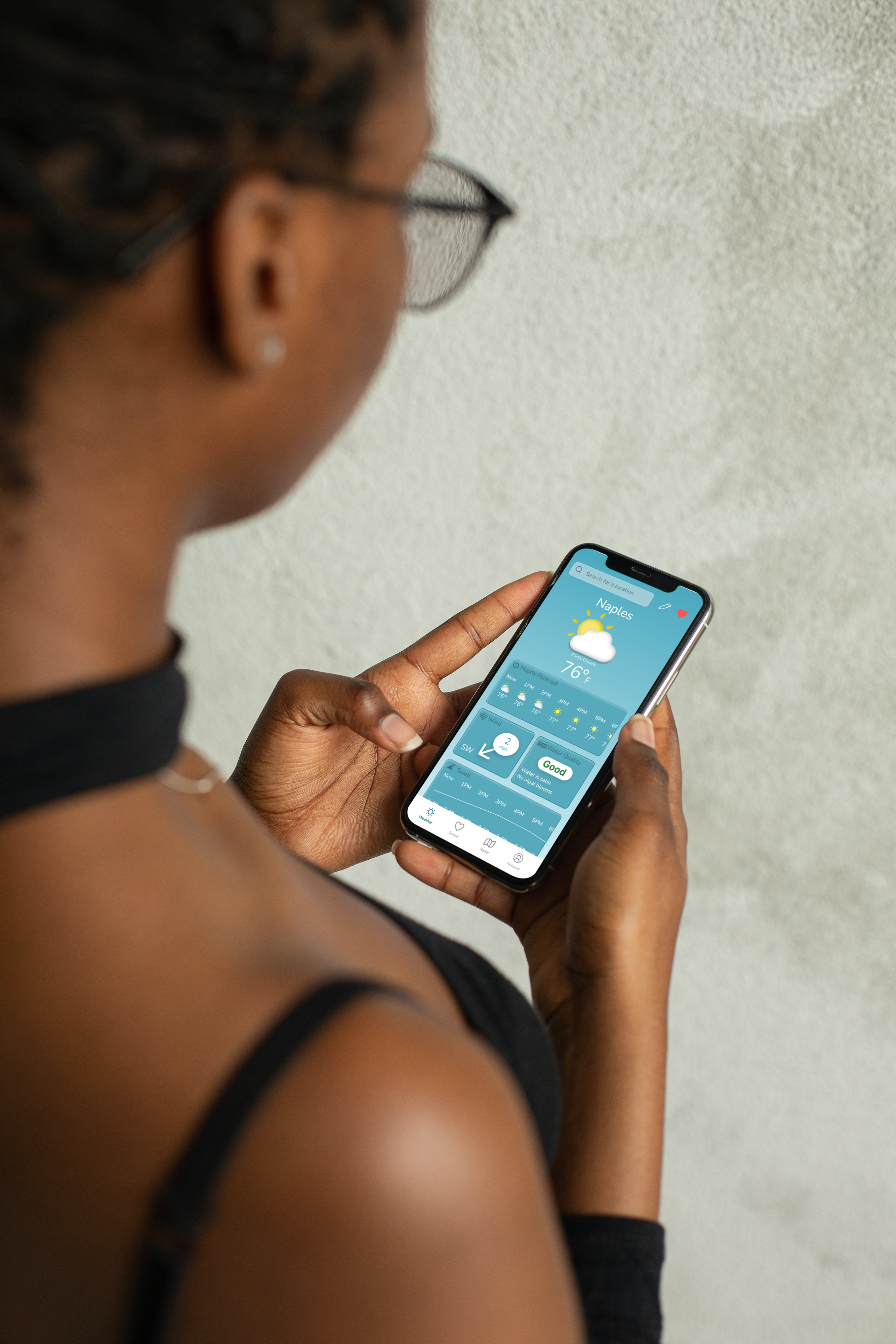
I used a combination of blue colors to evoke a calming feeling that would remind users of the water.
The background of the main weather page changes color based on the current weather. Blue gradients represent clear skies whereas grey gradients represent rain and storms. Users can get a real sense of the weather by looking at the screen to help them feel more confident for a day on the water.
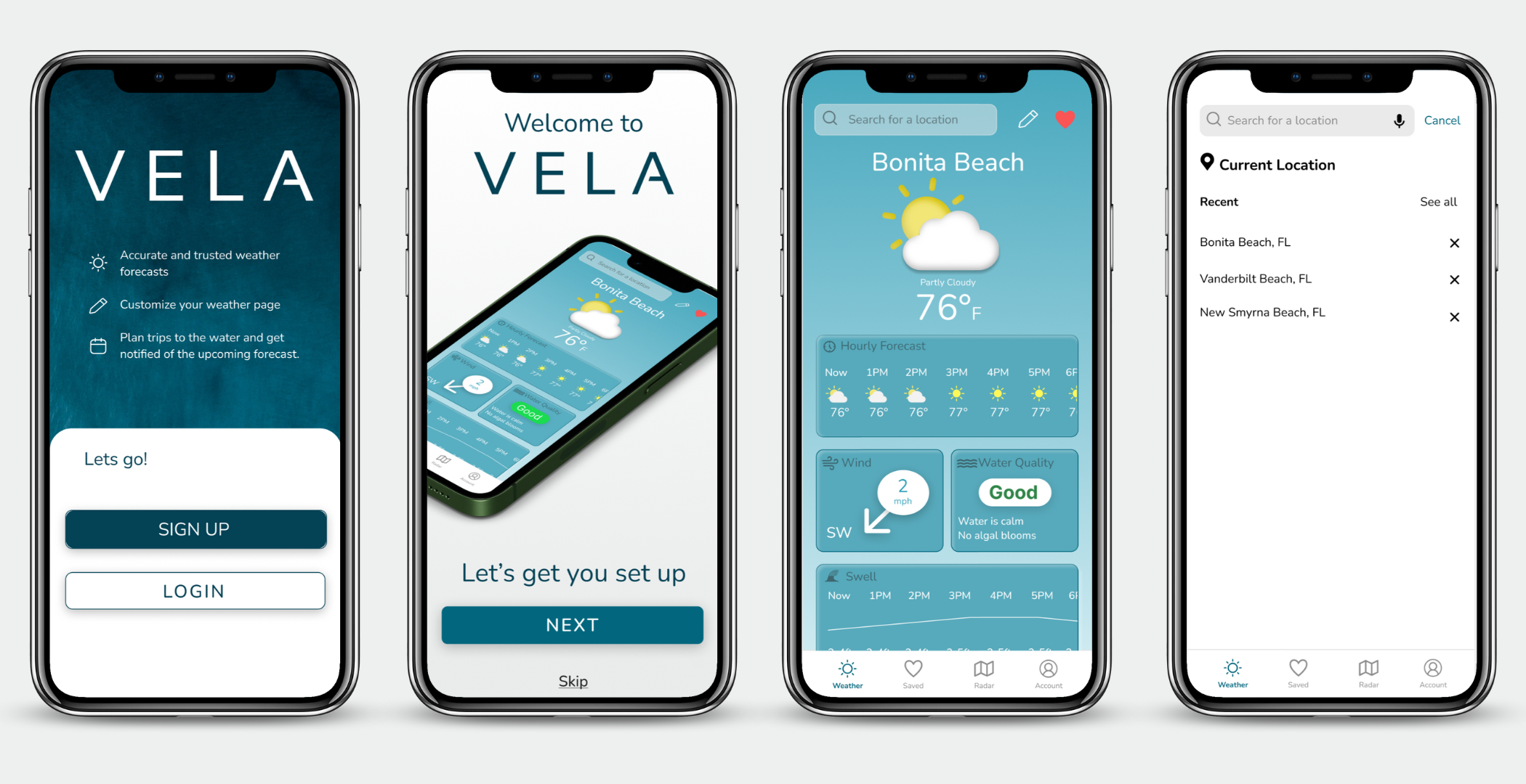

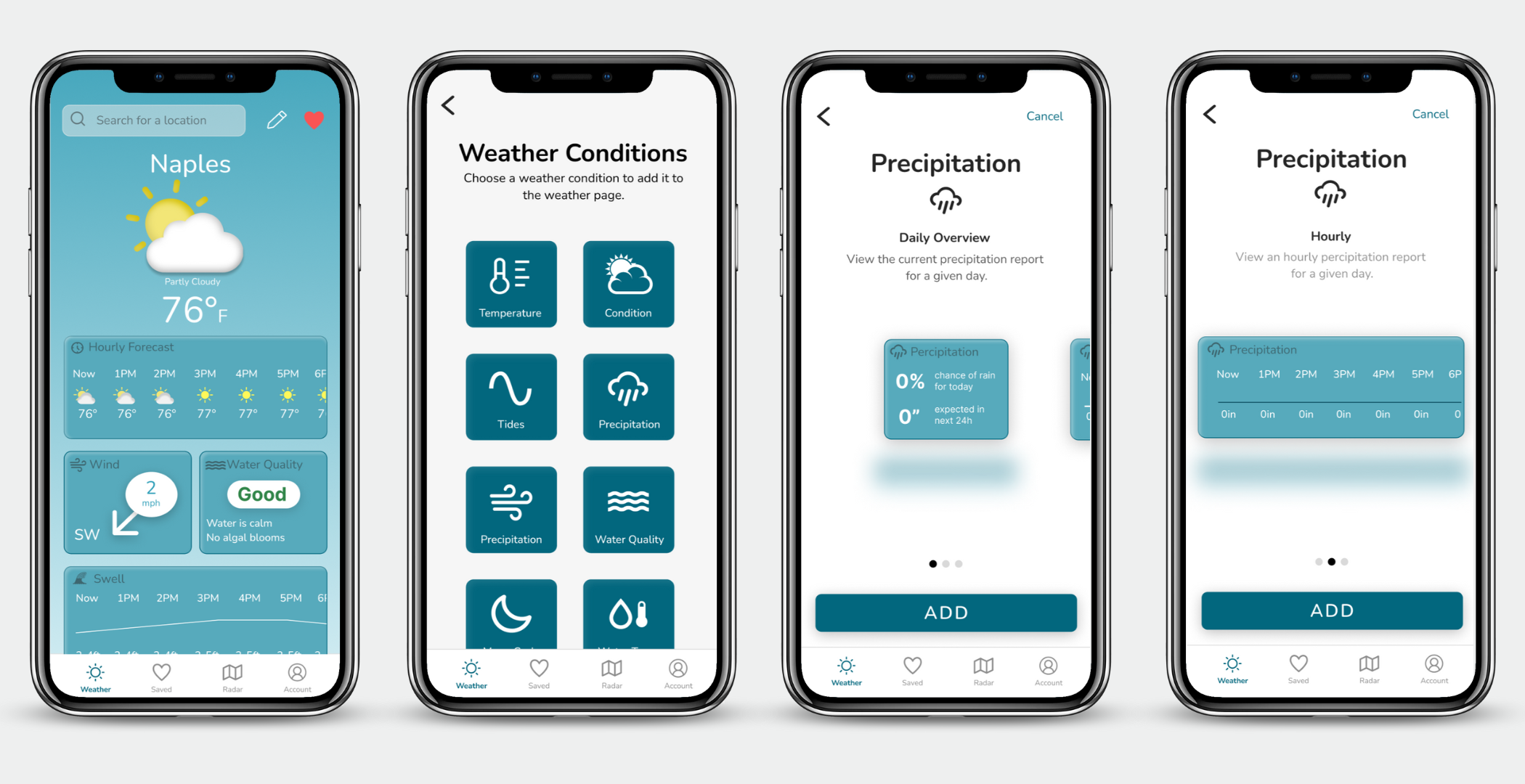
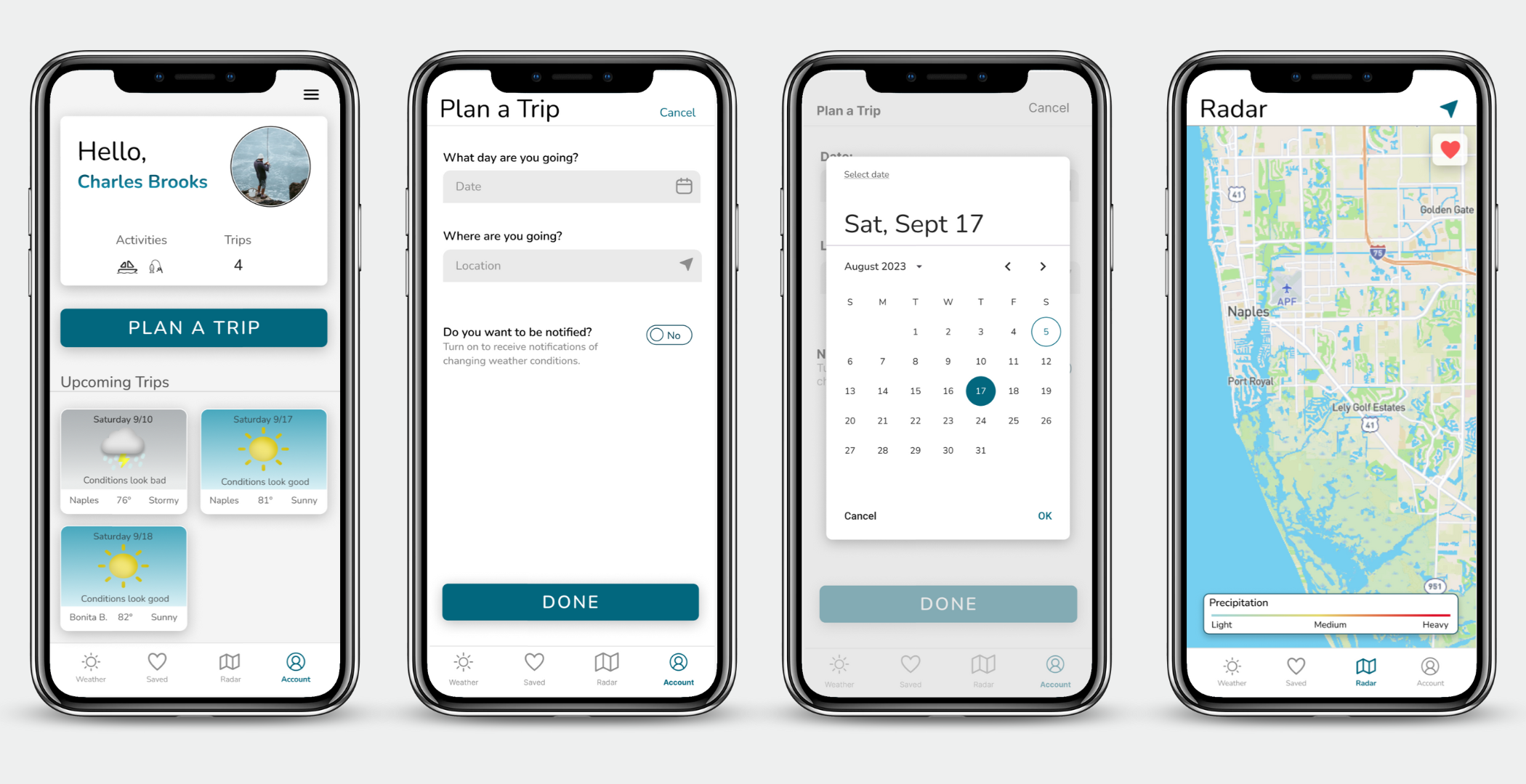
Vela was designed while thinking about accessibility and inclusivity.
It allows users to make confident decisions about their day on the water by displaying accurate and easy-to-understand weather data.
Users can choose their favorite activities in the onboarding. This will fill their weather page with all the weather information they need (which was determined from the survey.) If the user still feels they are missing data, they can simply add it with Vela’s intuitive customization feature.
Users will be pleased they can have all the weather data they need in one place!
What’s Next
Next Steps
Now that Vela’s UI is complete, I would love to move on to more usability testing to ensure it evokes the correct feeling.
The design needs to be evaluated by potential users to see if it helps solve our problem statement. More usability testing will also lead us to new problem statements that the business might choose to solve.
After the design is tested and iterations have been made, it will be ready for development. The proper design documentation will be made and passed off to developers.
Retrospective
This project taught me a lot about the importance of user interviews and research. UX design is defined by the relationship between human behavior, design, and businesses. To best understand how our users will benefit from our products we need to talk to them. We need to learn their wants, needs, and pain points. By asking our users the proper questions we can get to the answers we need.
The questions we ask our users need to lead us to the answers to the questions we are trying to solve. I learned about this while I was going through my preference tests. I asked a user a simple question. “Which design looks better?”
For this example, I was looking for what design captured their attention first, so the question was fitting. However, if I was trying to determine which one was easier to read, I might not have gotten the correct answer by asking, “Which design looks better?”
I learned a lot about how to strategicially word interview questions to get answers for the questions I am trying to solve without asking leading questions.
Let’s Get in Touch
